Medichecks
Role
Year
Website
Discipline
Team
Role
Year
Website
Discipline
Team
OVERVIEW
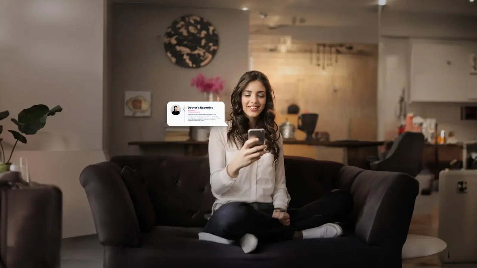
I joined Medichecks as part of the in-house design team, working across web, print, packaging and video. Partway through, the company took on a full rebrand. It had outgrown an identity built for a smaller business and needed one that matched its position as the UK's first direct-to-consumer blood testing company. I was part of that process, then spent the following years applying it.
Most of the job was application, week after week. Product pages and test finder cards built to match the design system down to the detail. Sample collection kit packaging, from the Optimal Health range through to the instructions for use, which is the least glamorous and most scrutinised print job in the business. A premium PR kit for brand ambassadors, box and booklet. A customer health story film made on almost no budget. And a growing library of 3D product visualisation. When the rebrand came, I worked on reshaping the identity alongside Joshua and Rhian, then carried it back into those same surfaces.
A brand applied consistently across every surface the company sells and ships on. The 3D library changed how the team worked: packaging could be shown, approved and marketed before anything was printed.
In-house, across web, packaging, print and film
Product visualisation that removed the photoshoot from launching a product
Box and booklet, built for the brand ambassador campaign
THE JOURNEY
Reshaping the identity took months. Living with it took years. The real work was application: making a test finder card, a kit sleeve, an instructions-for-use leaflet and a PR box all read as the same company, when each went through a different team, a different printer and a different set of constraints. Packaging was the sharpest version of that. Instructions for use are regulated, cramped, and read by someone about to take their own blood, so clarity beats styling every time. The 3D visualisation started as a practical fix for showing packaging that did not exist yet. It became the thing I was asked for most, because once you can render the kit you can put it in a campaign, on a product page or in a partner deck the same afternoon.
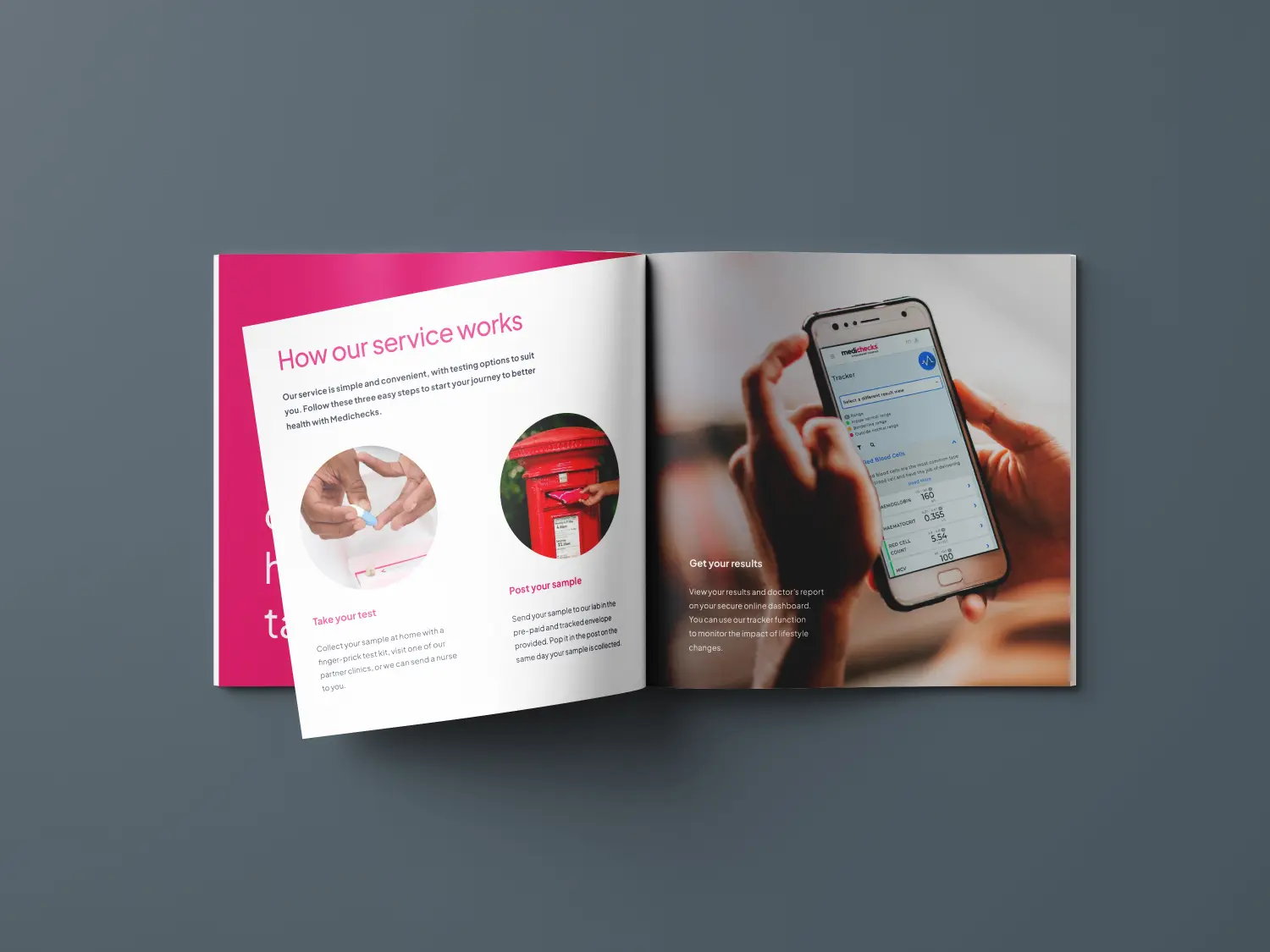
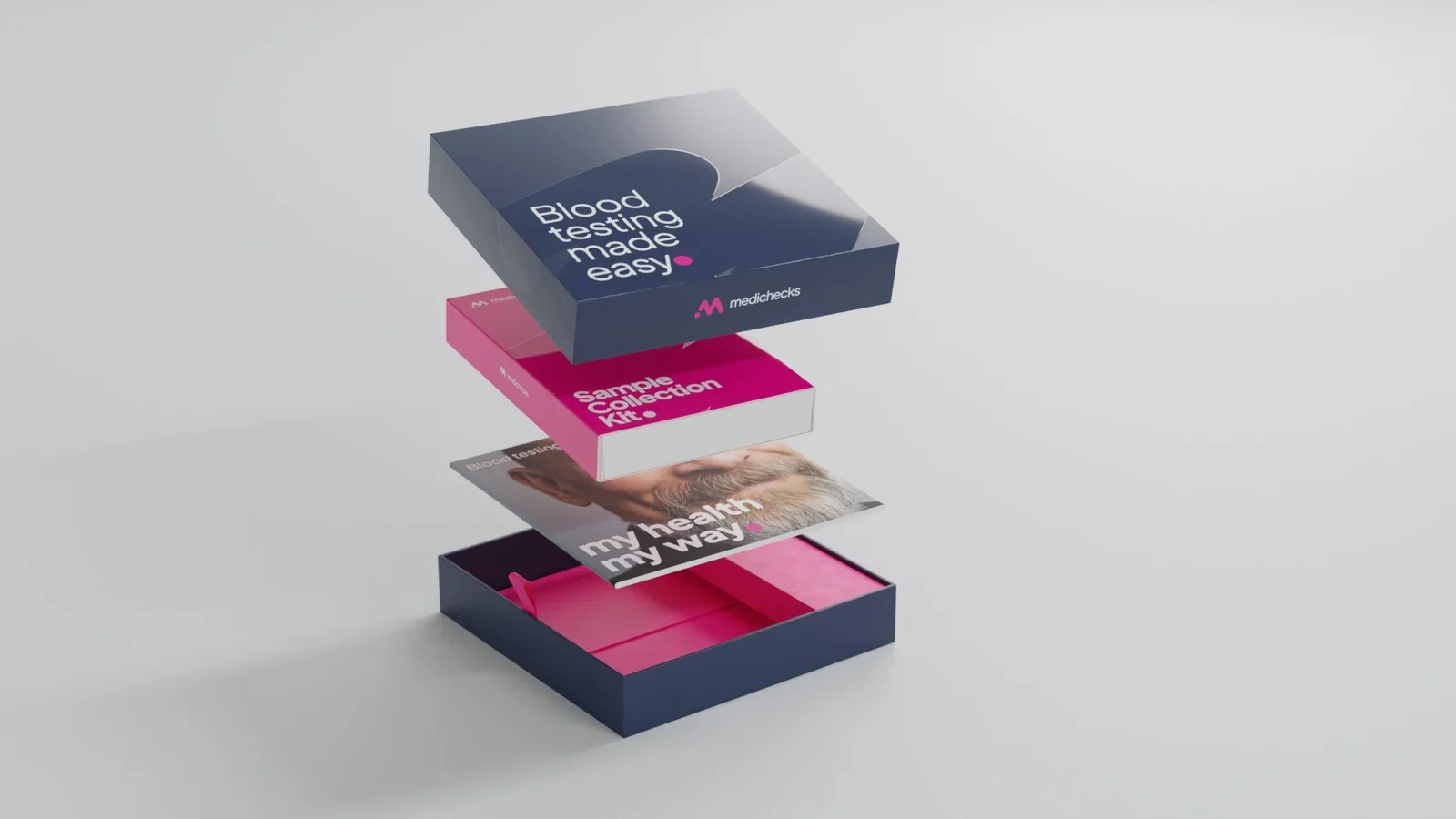
PACKAGING
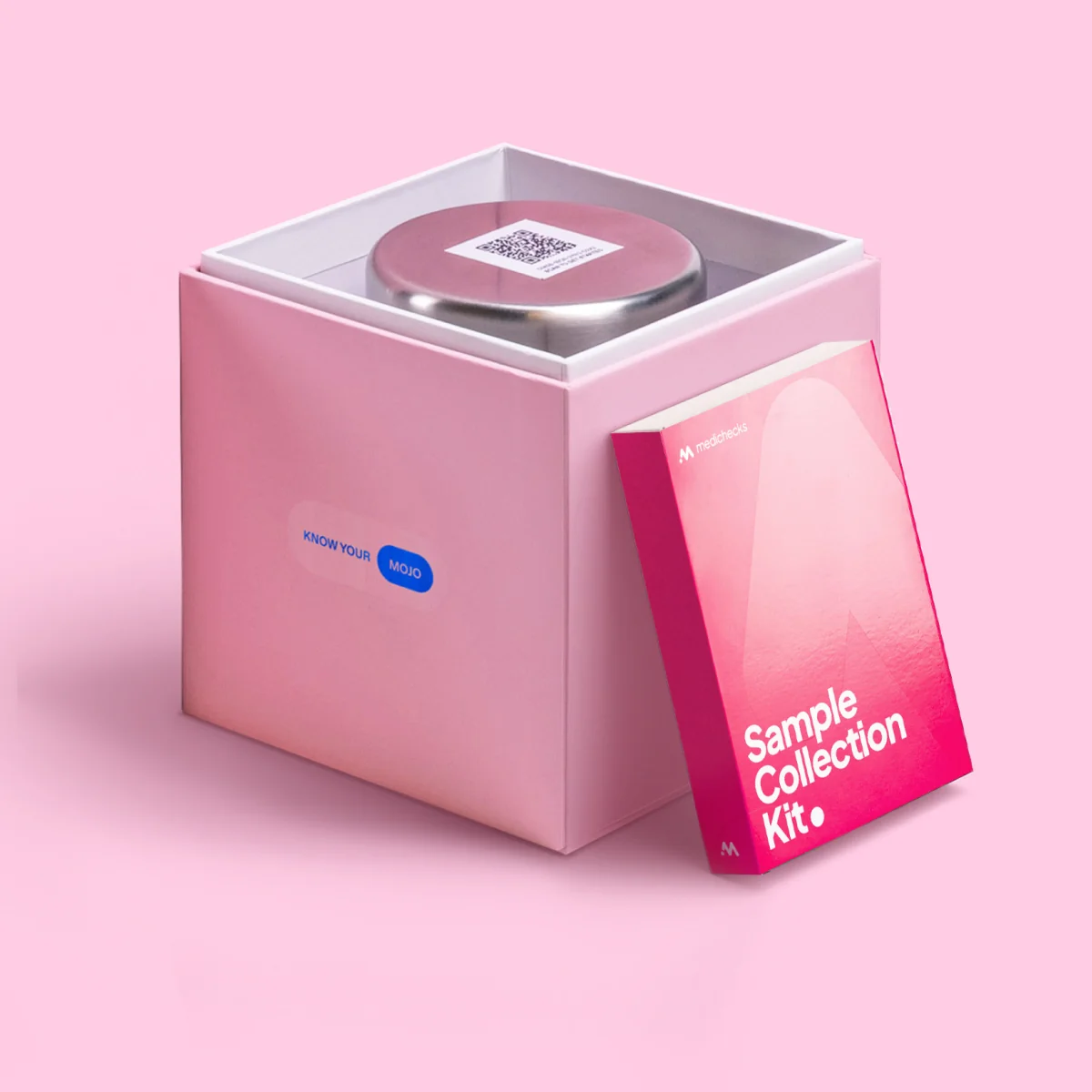
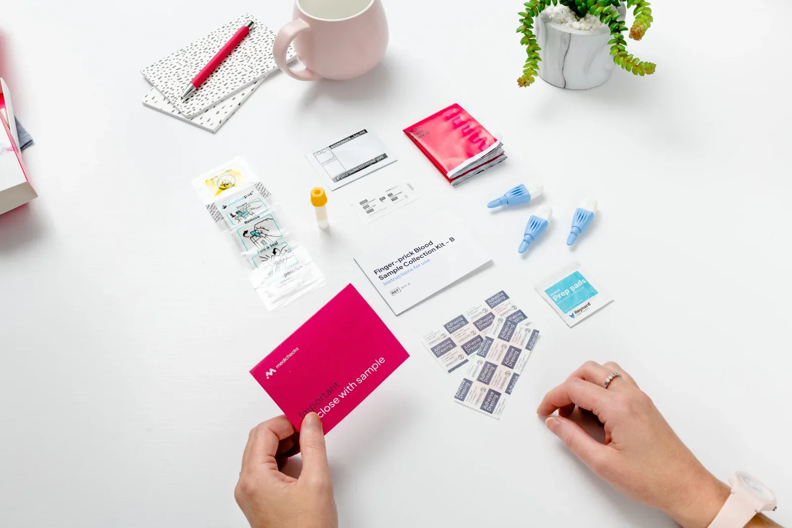
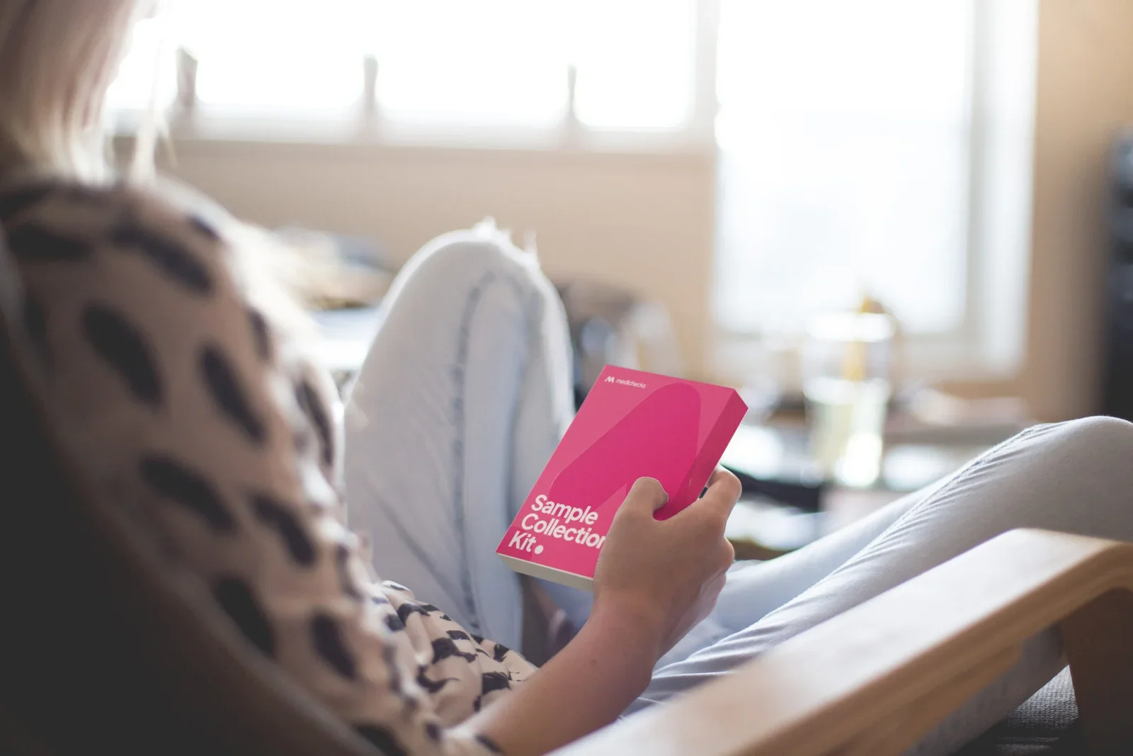
The outer sleeve, the Sample Collection Kit and everything inside it, from the unboxing to the contents laid out ready to use.
DIGITAL
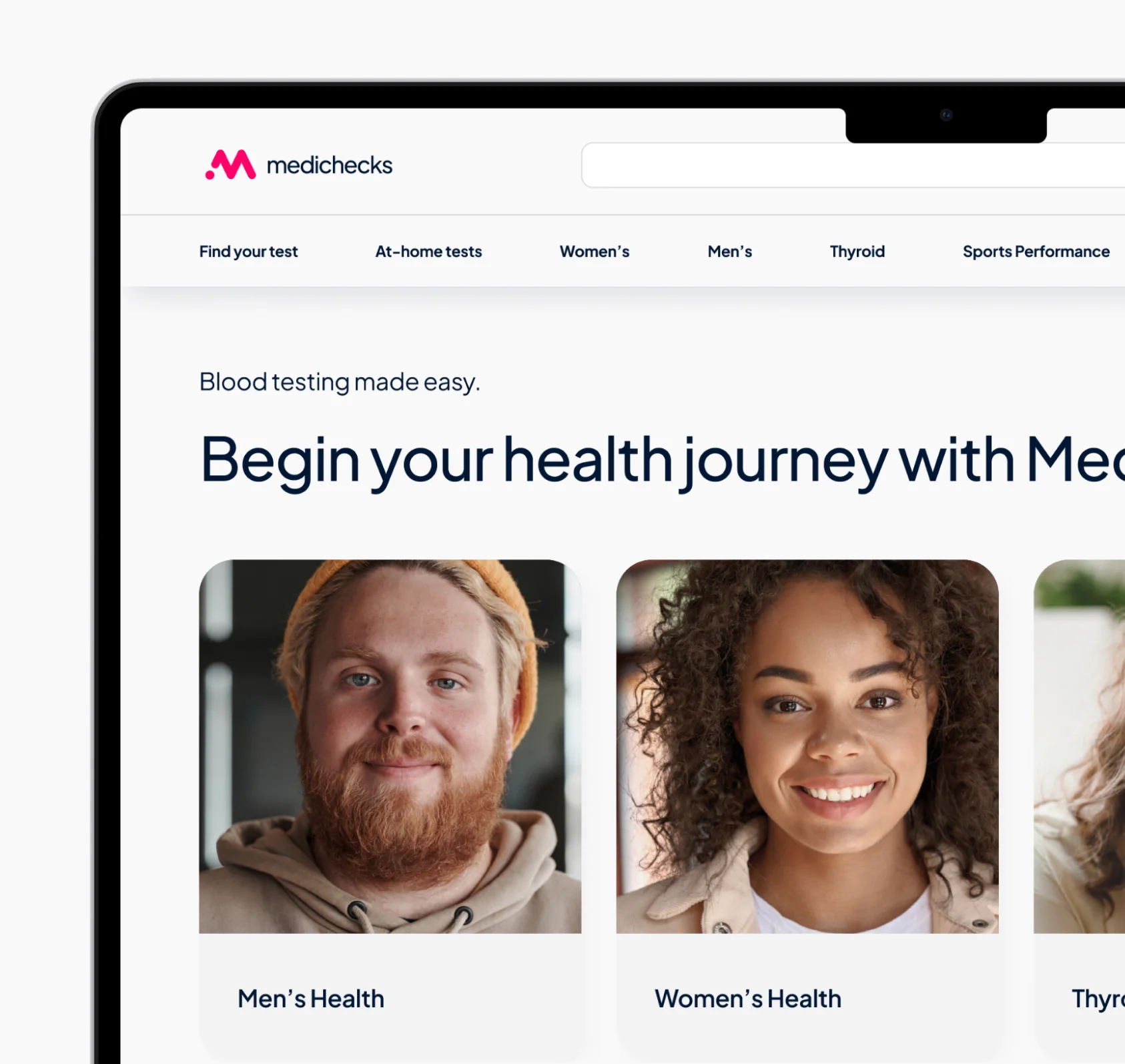
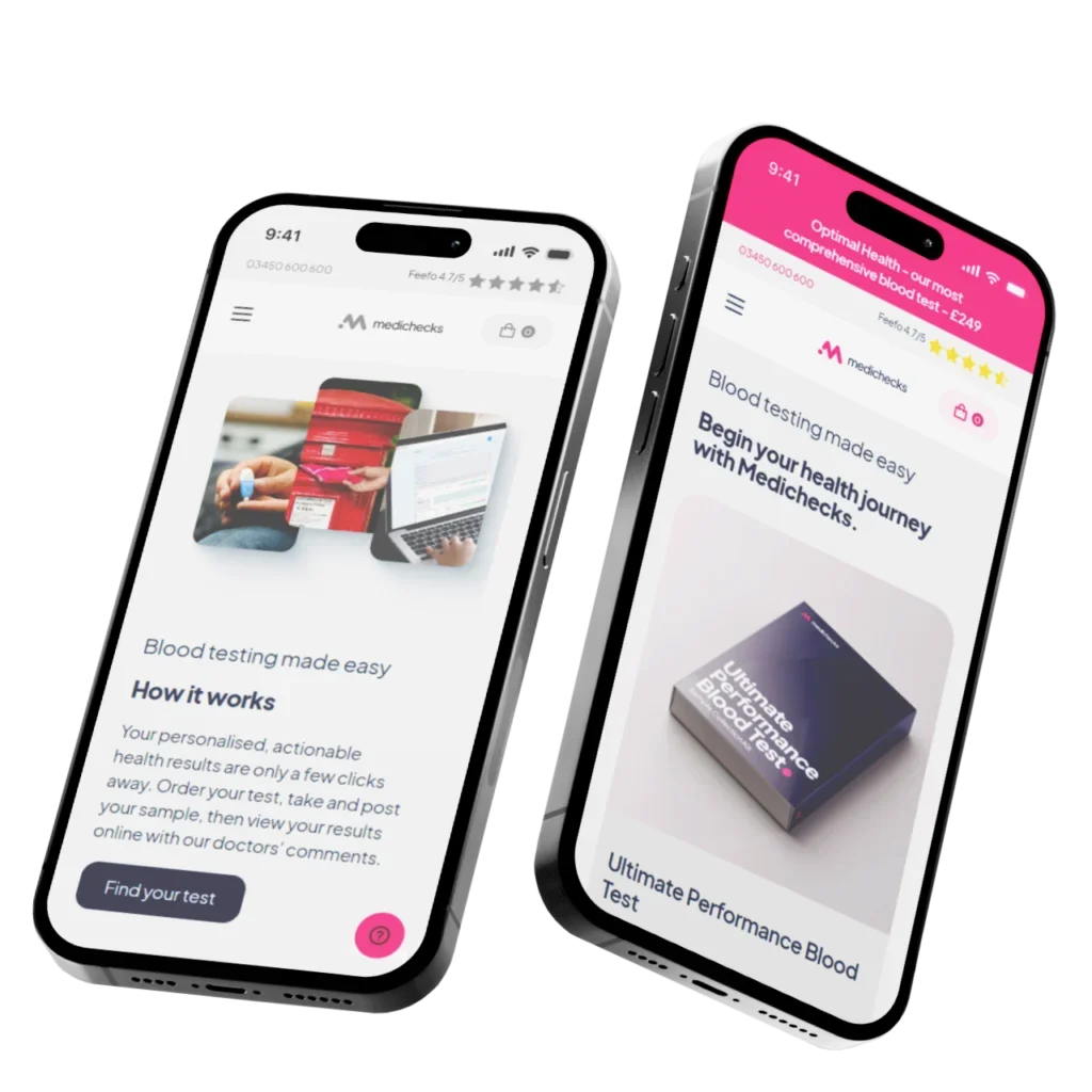
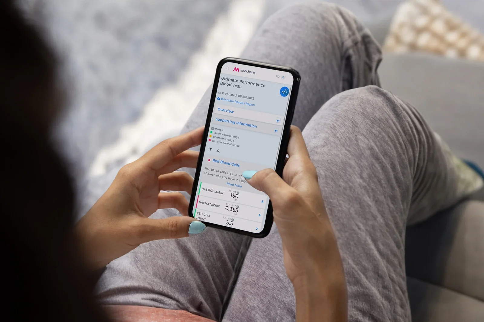
The homepage on desktop and mobile, the results screen, and the green icon in motion.
Company-wide rebrand
Worked on the rebrand as part of the in-house team, then applied it across web, packaging, print and film.
3D product visualisation library
Built for the kit and packaging range, removing the photoshoot from launching or marketing a product.
PR kit and test finder cards
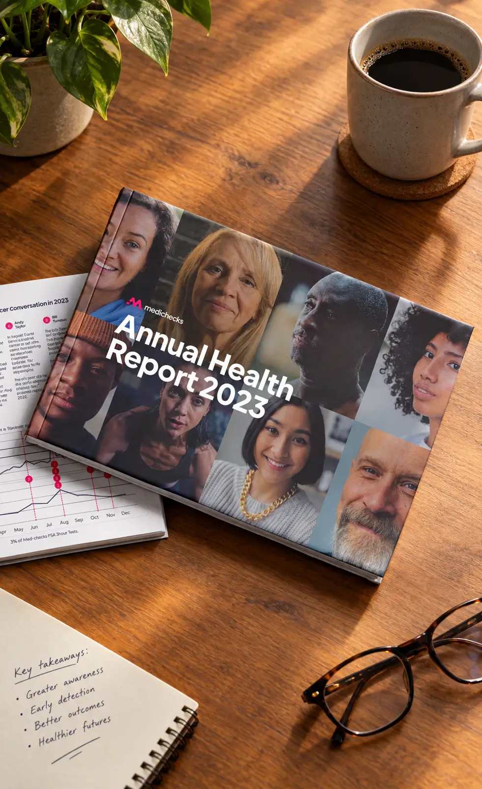
The brand ambassador kit, box and booklet, plus the test finder product cards that went live on site.
Medichecks taught me that consistency is a people problem before it is a design problem. Staying aligned with Joshua and Rhian was straightforward. Staying aligned with marketing, the doctors and compliance was the job. Feedback that year told me my communication across departments needed work, and fixing that did more for the output than any craft improvement I made in the same period. I started checking in before I needed something rather than when I did, and took on the project management of my own work instead of waiting to be chased.
Open to senior and lead design roles.
Get in touch