Stilo Group Services
Role
Year
Discipline
Team
Role
Year
Discipline
Team
OVERVIEW
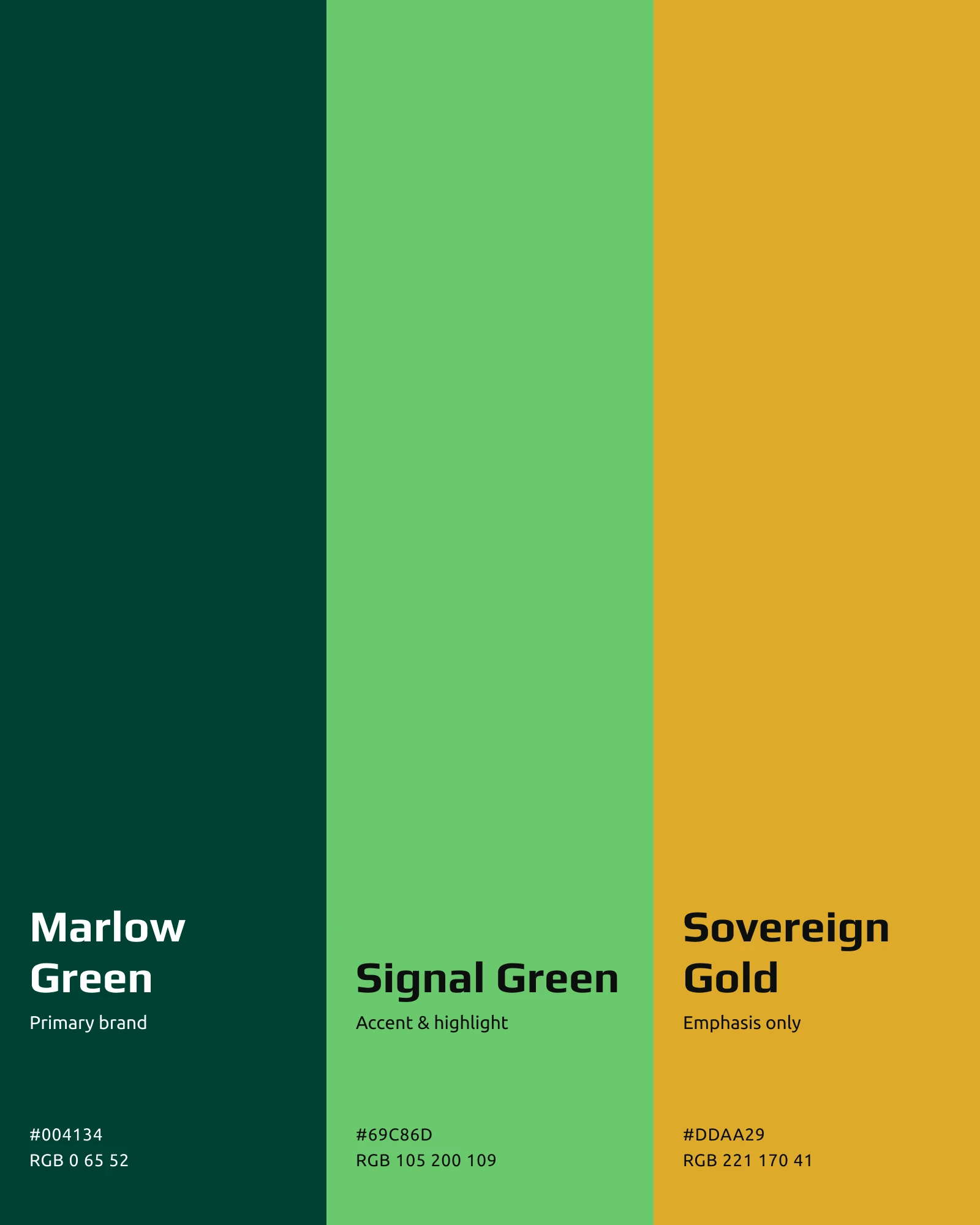
Stilo handle security, audiovisual, connectivity and embedded consulting for large organisations. The brand needed evolving rather than replacing: a refreshed logo that retained the trust and authority it had already earned, a system that worked across digital, print and social, and a clear colour palette led by a dark green primary.
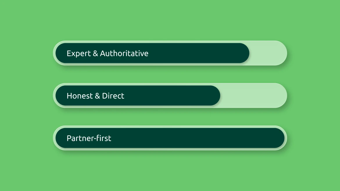
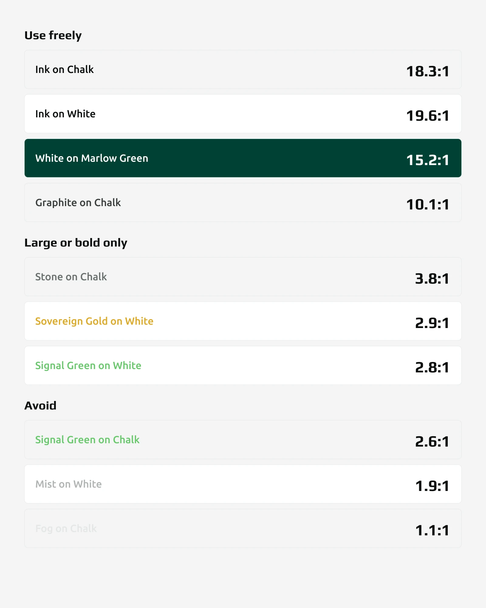
The work was deliberately phased, so progress could happen without overcommitting upfront. The logo came first, refreshed for legibility at small sizes and on screen while keeping the mark recognisable. The palette was built around Marlow Green, with Signal Green and Sovereign Gold as accents, and every pairing was checked for contrast before it went into the guidelines. Tone of voice was defined alongside it: expert and authoritative, honest and direct, partner-first.
A complete brand system: a logo suite with light and dark variants, a colour palette documented with contrast ratios and clear usage rules, and full guidelines covering typography, iconography and tone of voice. It works across every existing touchpoint, on screen and in print.
Refreshed for digital, print and social use
Documented with contrast ratios for every pairing
Typography, iconography and tone of voice
THE JOURNEY
Stilo sit behind the scenes for a lot of businesses, handling the security, AV and connectivity that lets everyone else focus on their own work. The brand needed to reflect that quiet competence rather than shout over it. So the work was phased deliberately: refresh the logo first, keeping what people already recognised, then build the palette and the wider system around it. The team knew what they wanted, trusted the route we picked, and gave feedback that actually moved the work forward. That's rarer than it should be.


THE LOGO
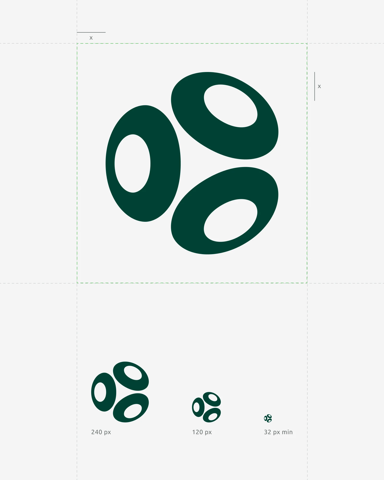
The mark on its three grounds, the clear space it needs, and the partner lockups it has to sit beside.






THE SYSTEM
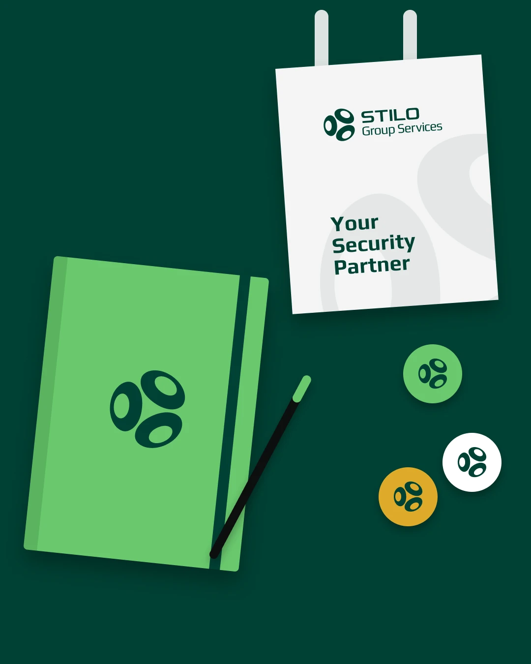
Icons, interface components and the brand values pills, plus the first applied pieces: staff passes and merchandise.





DIGITAL
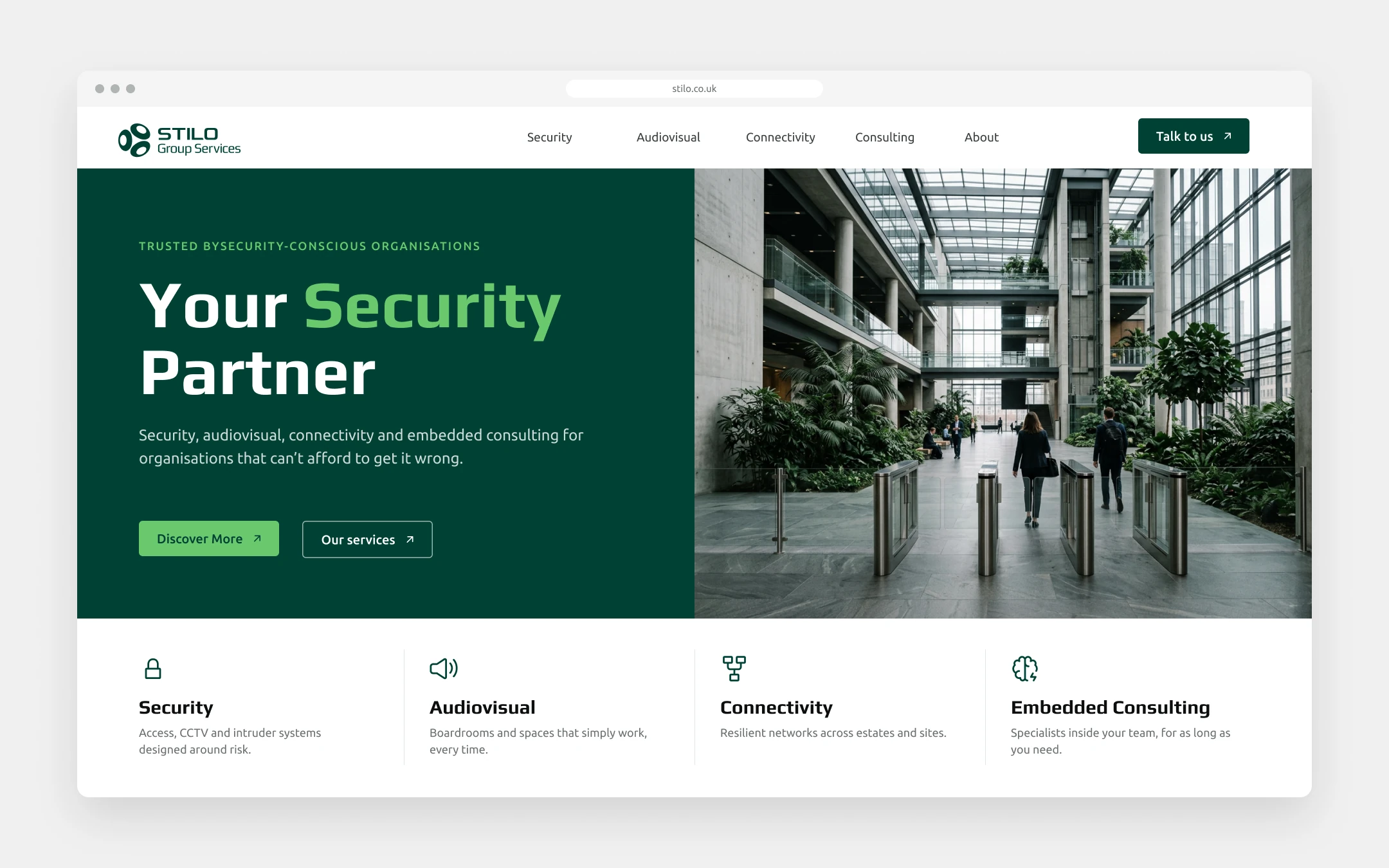
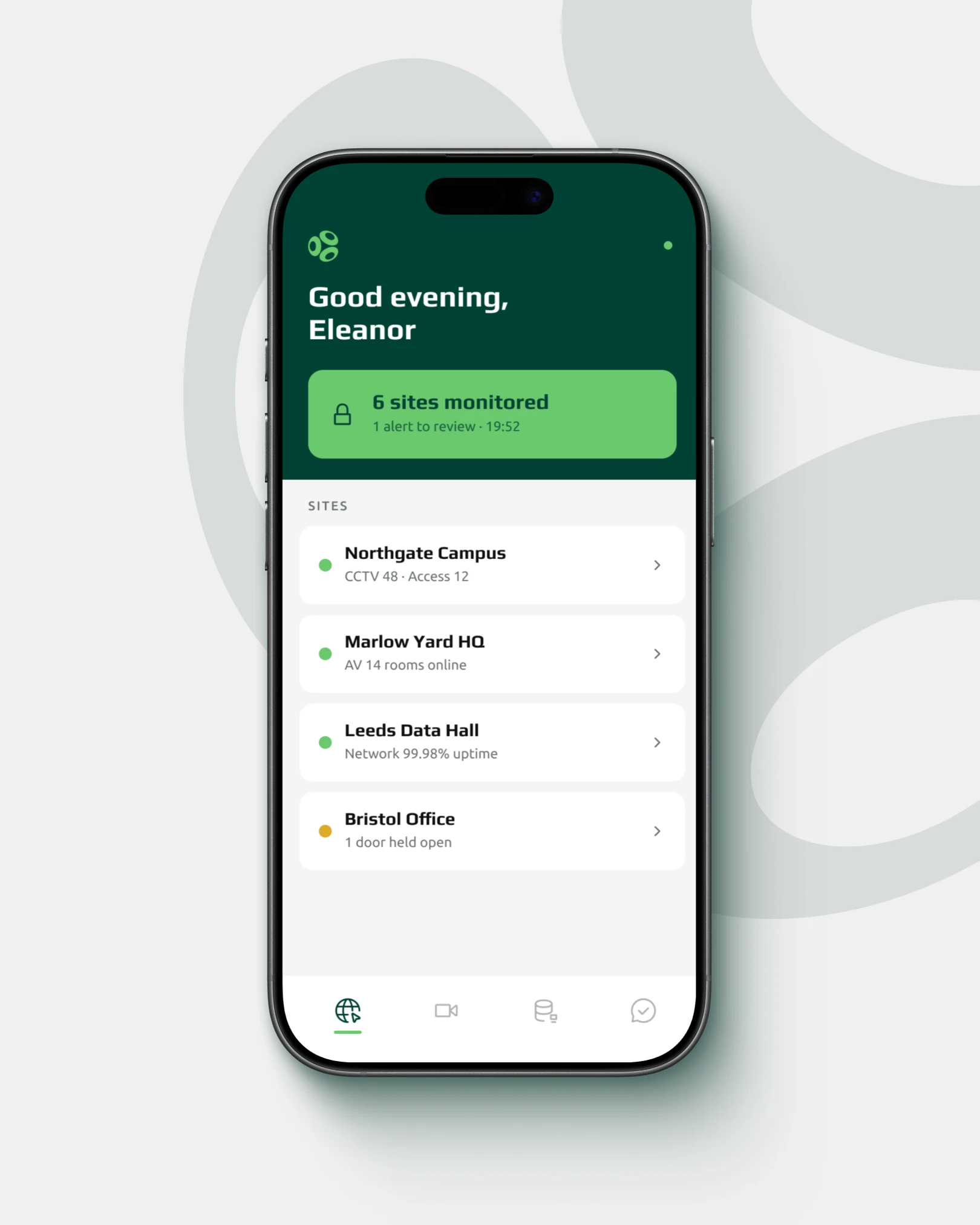
The brand on product surfaces: the website, and the site monitoring app the team carry with them.

IN THE WORLD
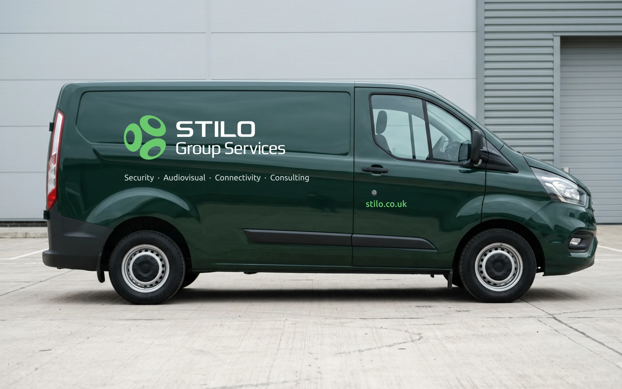
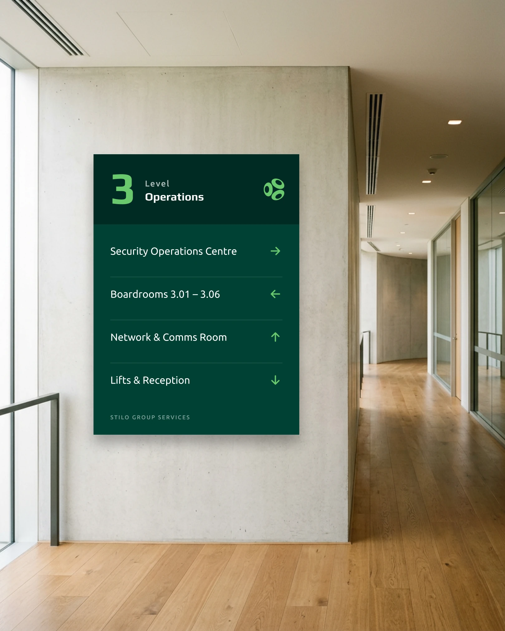
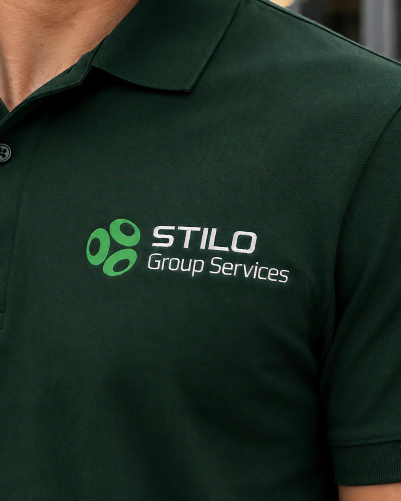
Livery, site hoarding, wayfinding and workwear, where the brand meets the people who use it.



THE PITCH
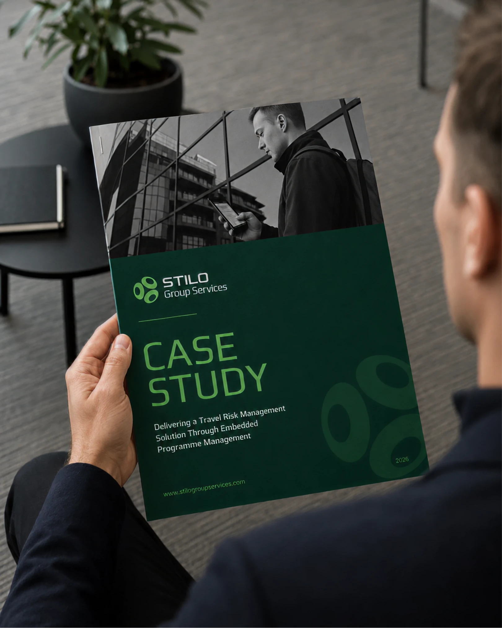
The case study document and the deck it comes from, so the brand carries into business development.

COLOUR
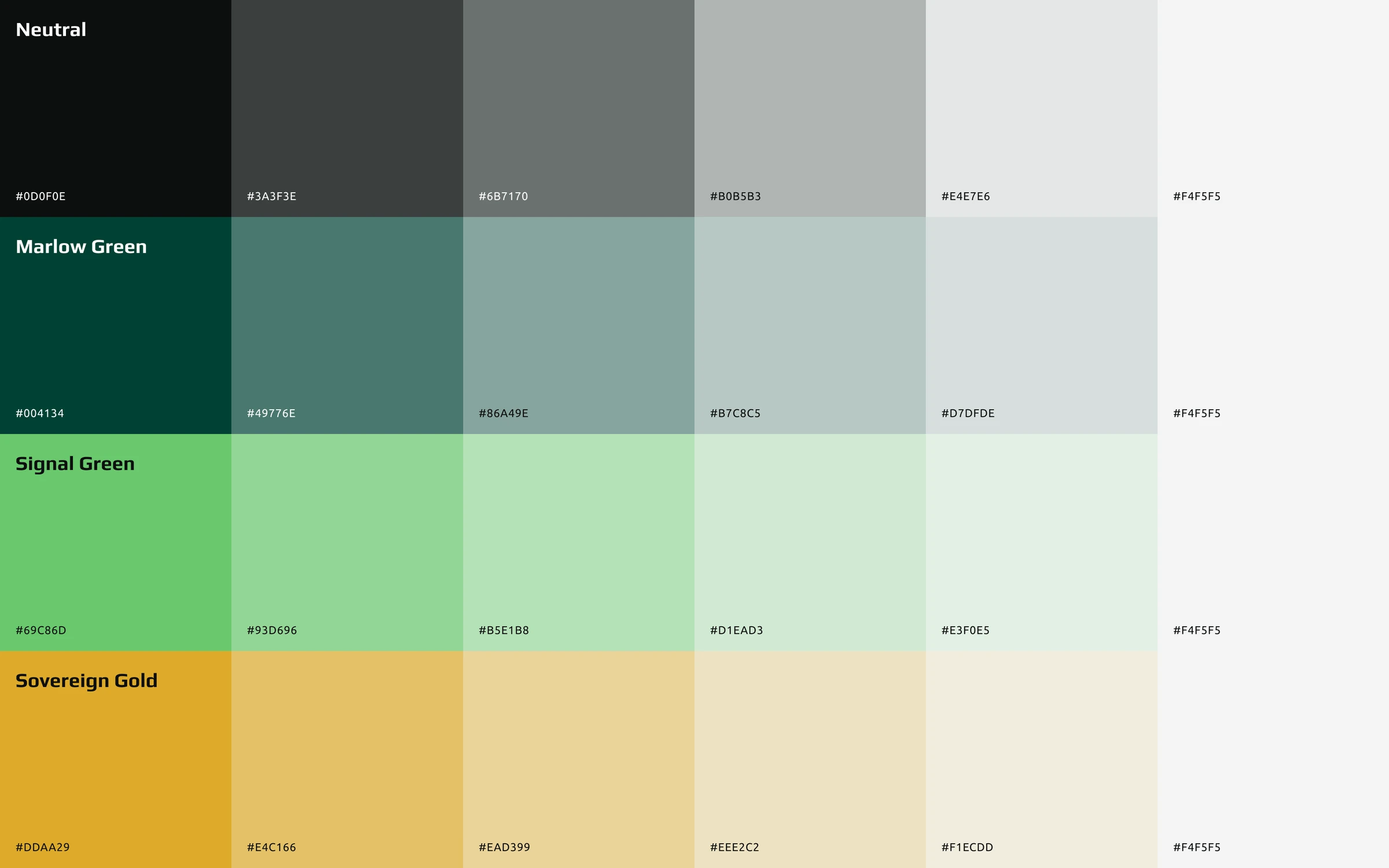
Three colours carry the brand, and every pairing is documented with its contrast ratio so nobody has to guess what is safe to use.
A logo refreshed, not replaced
Confident without shouting, and refreshed without losing the trust it had already earned.
A palette documented for print and screen
It behaves itself in both, with contrast recorded for every pairing.
Guidelines for a growing group
They keep the system consistent as it scales across every existing touchpoint.
The temptation with a brand that has already earned its standing is to redraw everything. The harder and better job was working out what was already doing its job and leaving it alone. Phasing the work meant we could make progress without overcommitting upfront, and what came out the other side is a system the team can keep using as they grow.
Open to senior and lead design roles.
Get in touch