BloomUX
Role
Year
Website
Discipline
Team
Role
Year
Website
Discipline
Team
OVERVIEW
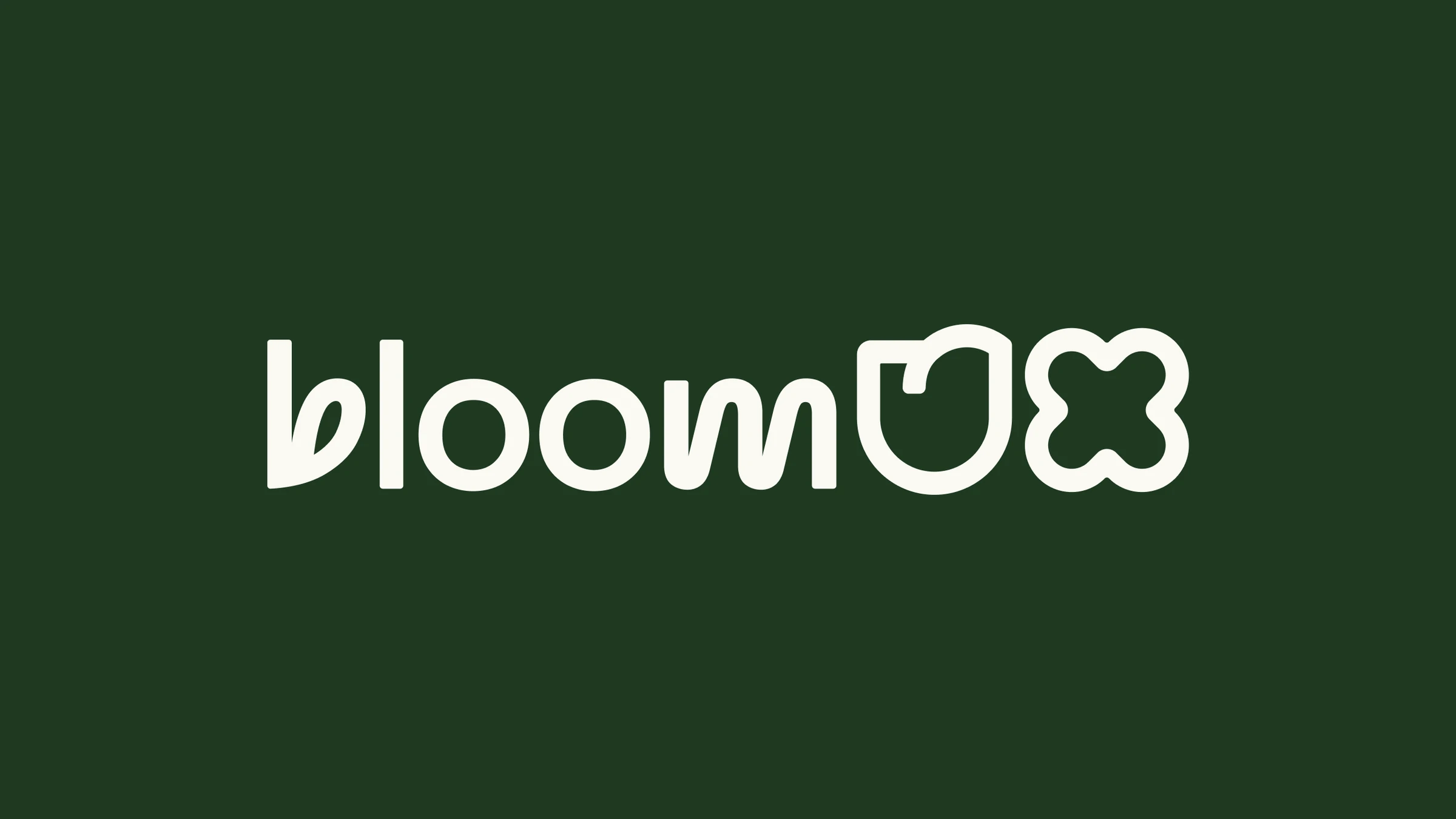
BloomUX help businesses grow through evidence-backed UX research and strategy. They needed a brand identity that communicated growth, insight and authority: a distinctive logo symbolising development and user-centred strategy, a full colour palette aligned to their values, social templates to build credibility, and guidance on website design and imagery, all applicable across digital and print.
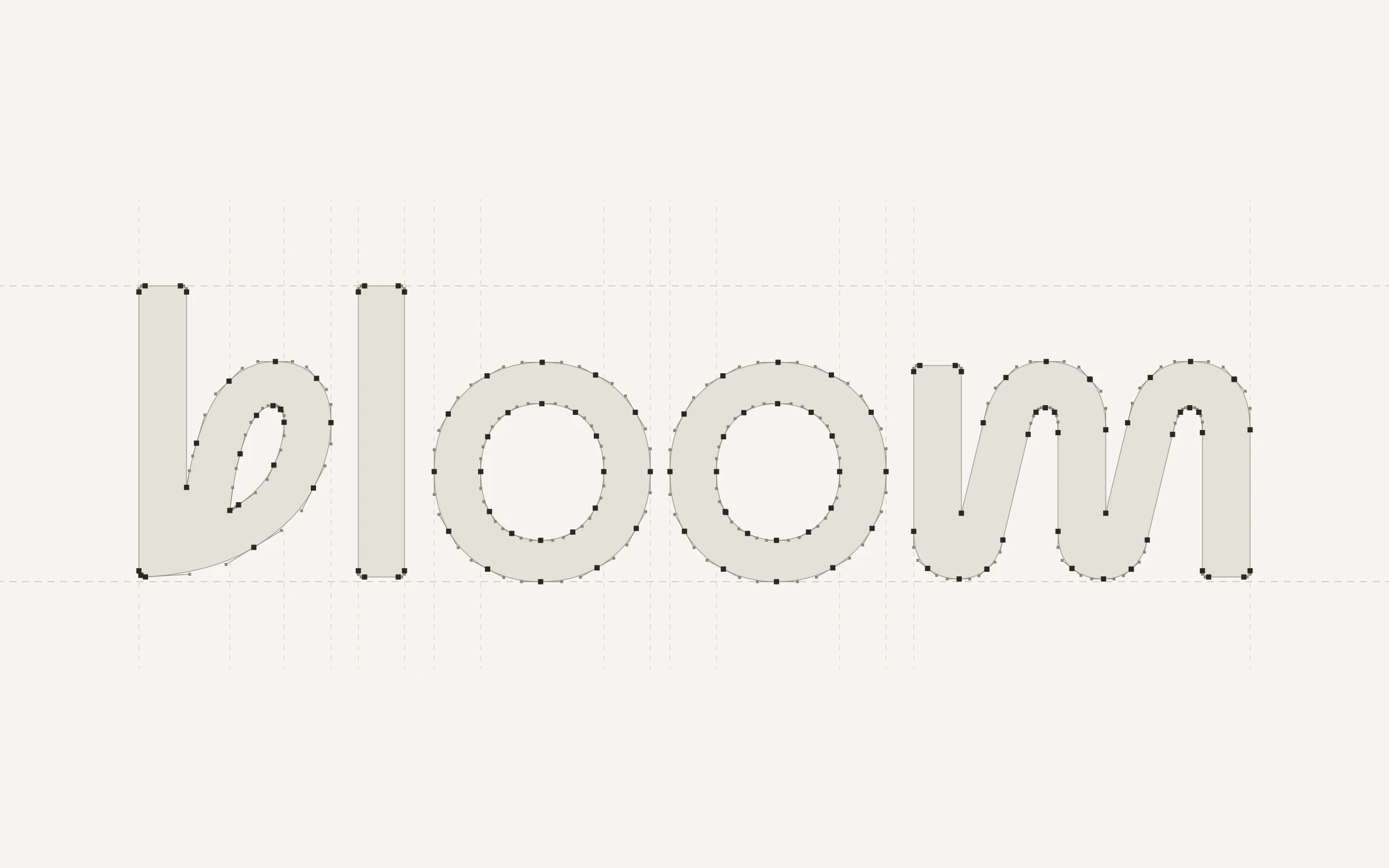
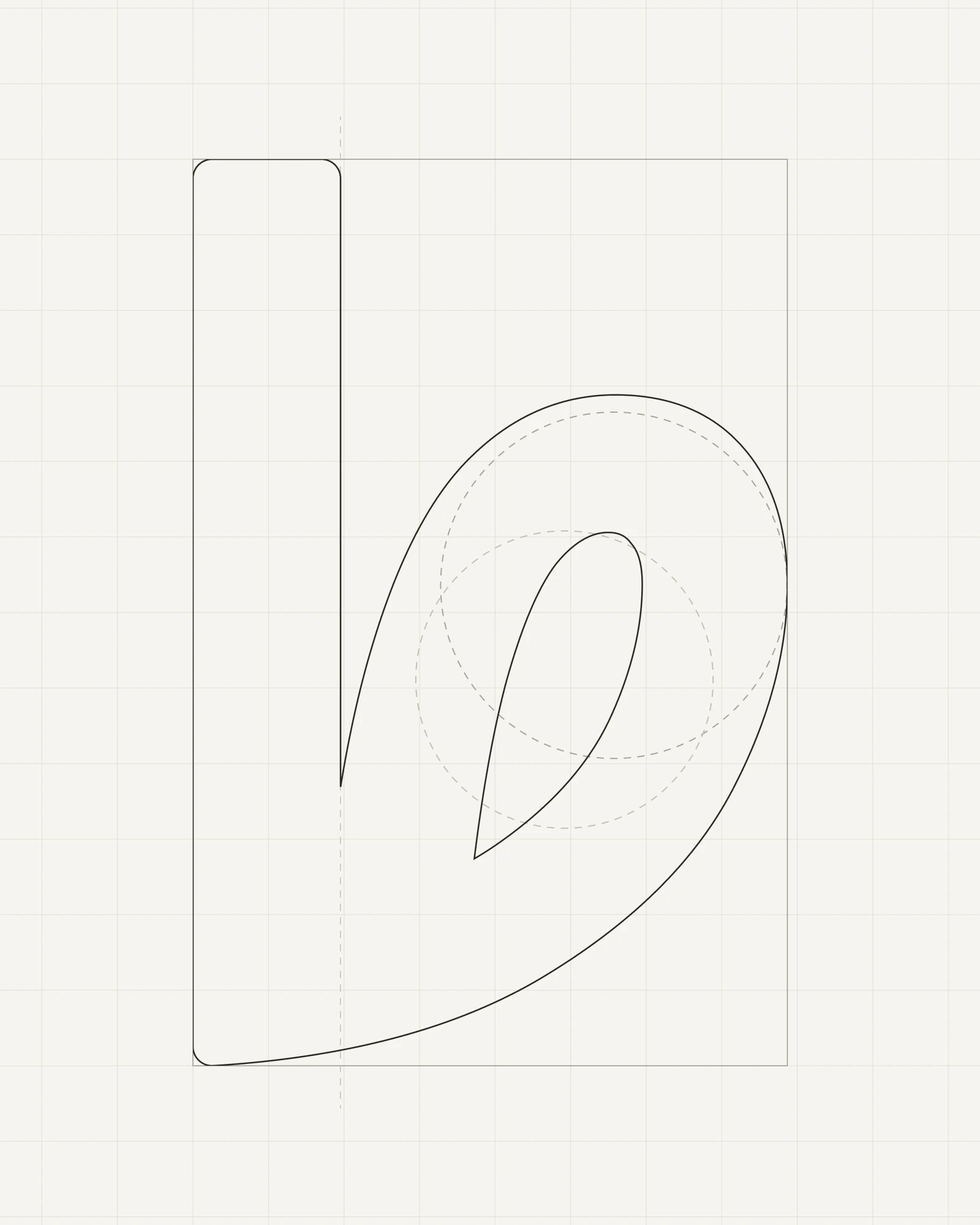
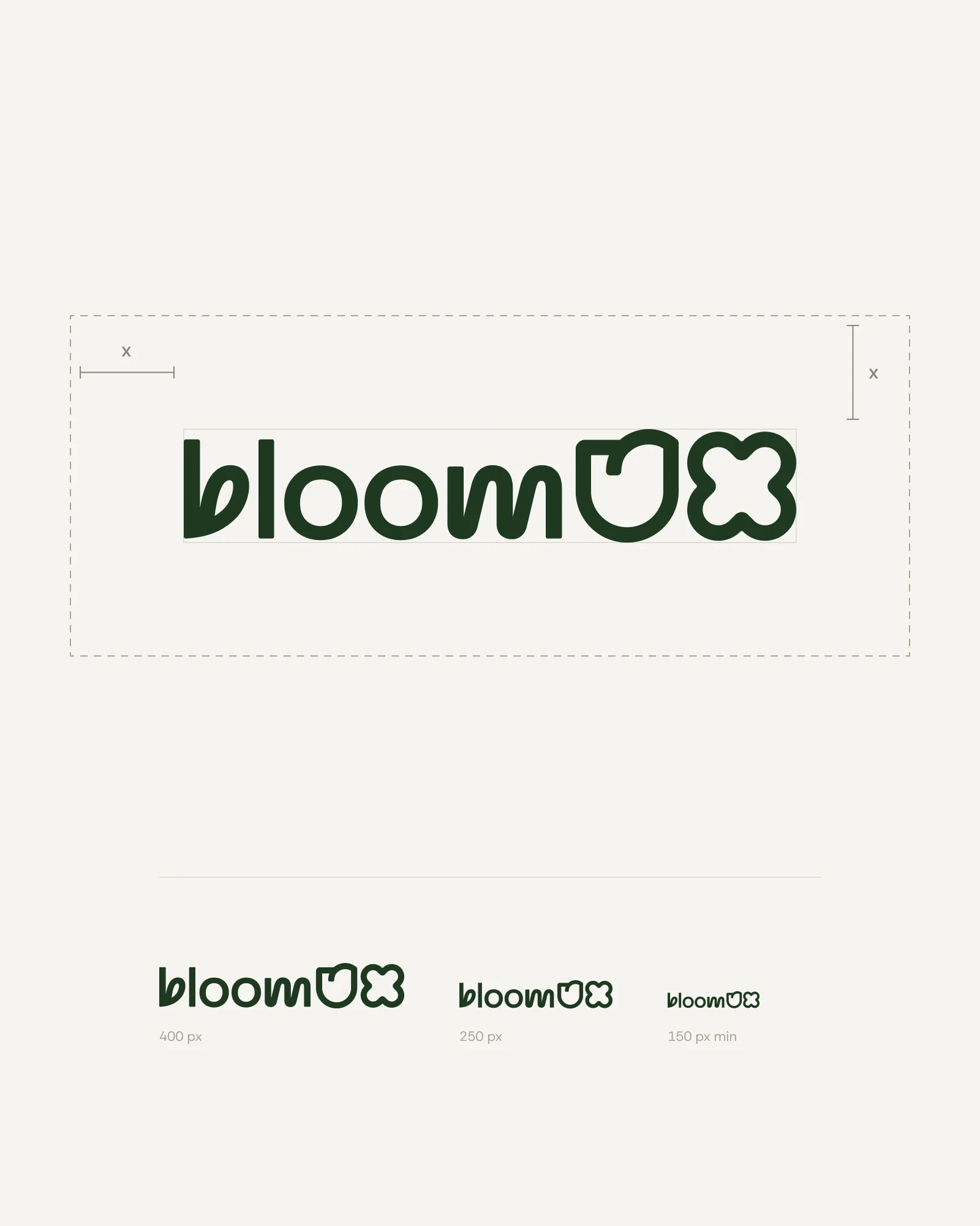
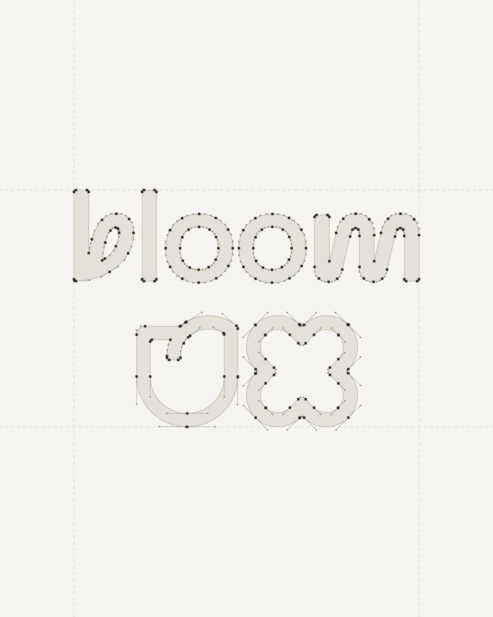
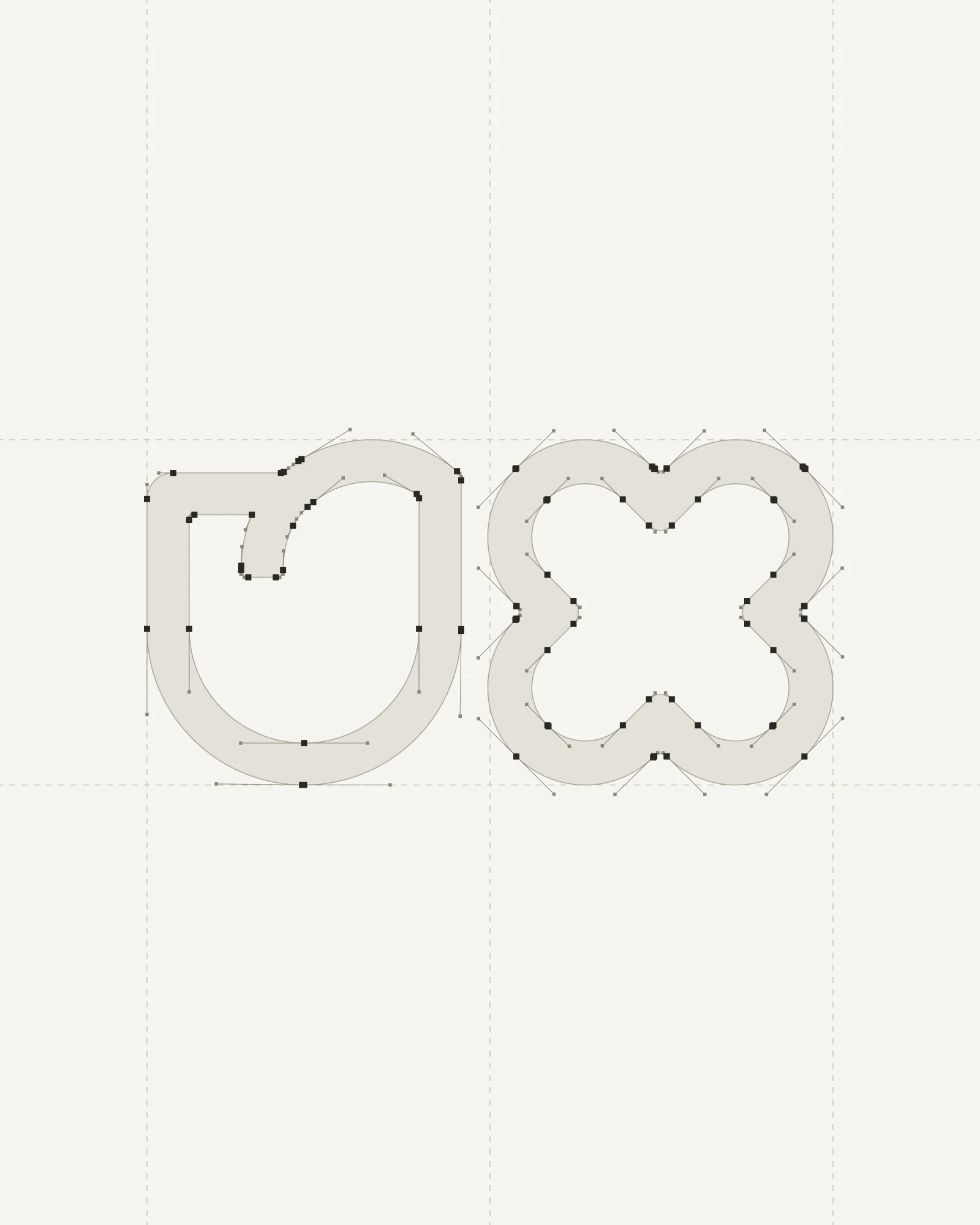
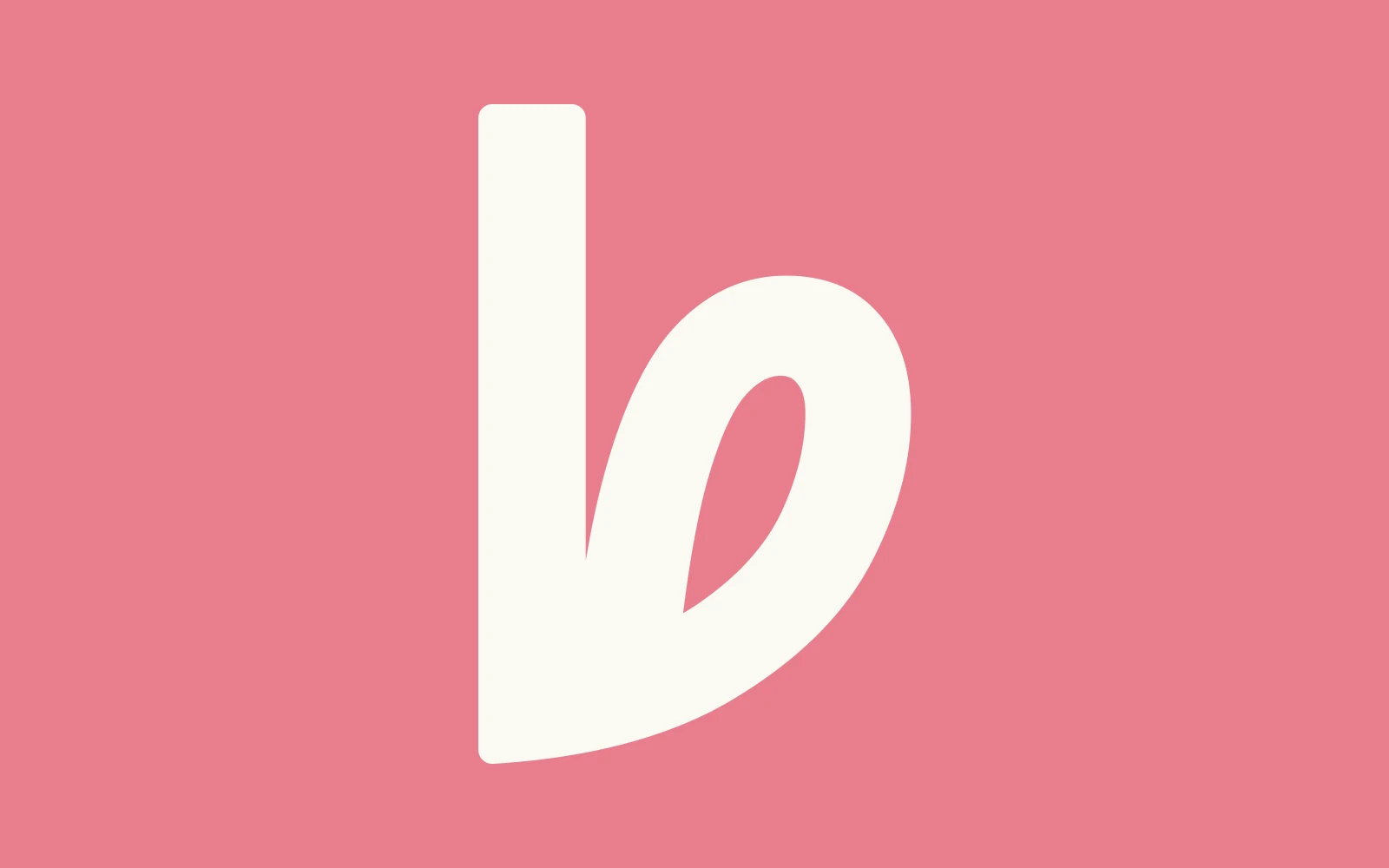
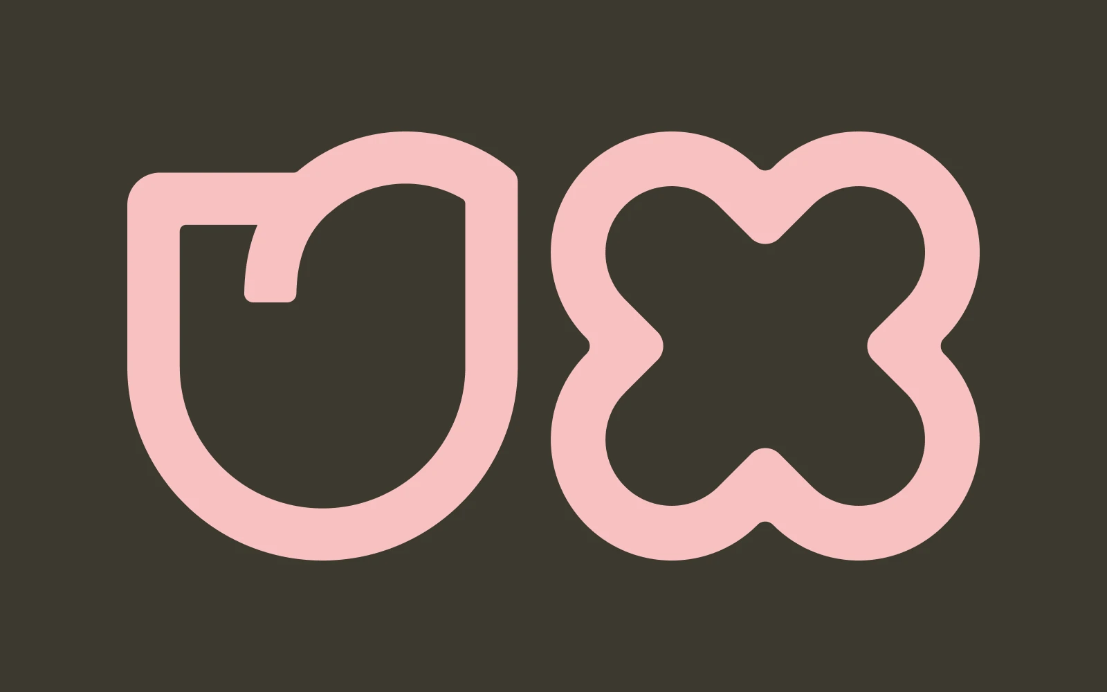
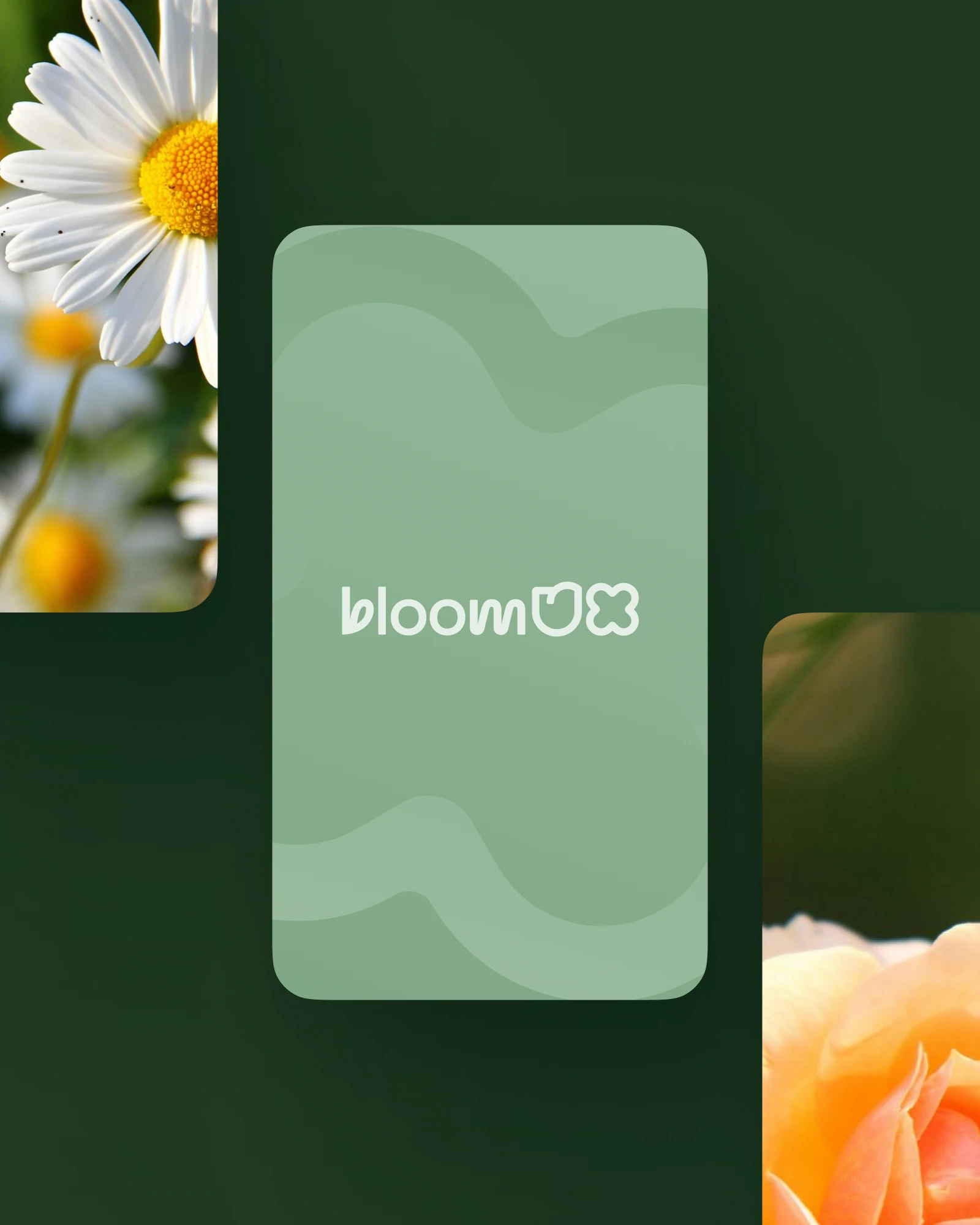
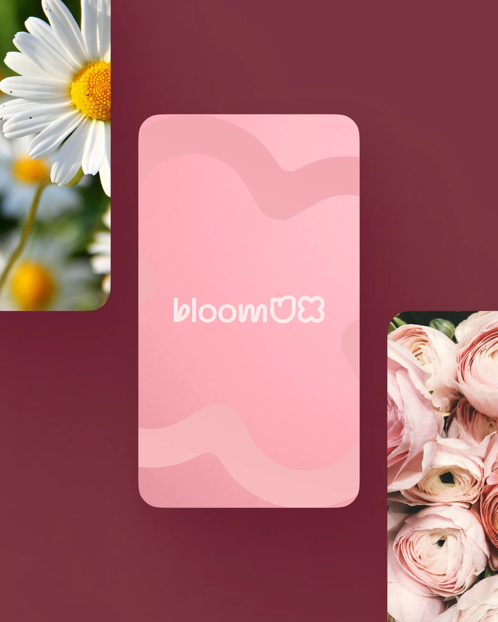
Habanero was selected as the typeface. The 'b' evokes a growing leaf, symbolising development, while the 'UX' forms shapes reminiscent of a daisy and a rose: growth through user-experience strategy. A versatile palette was built around a deep green core, chosen to stay flexible across digital and print without losing cohesion. Full guidelines followed, covering typography, colour usage, iconography and tone of voice.
A cohesive visual system across every touchpoint: logo and iconography that communicate growth, insight and expertise; social templates that make regular, professional content straightforward; and guidelines that let BloomUX expand their services and audience without compromising brand integrity.
Logo, palette, iconography and tone of voice
Templates for regular, branded content
Room to add services without redrawing the brand
THE JOURNEY
BloomUX's whole proposition is evidence over instinct, so the identity had to earn its decisions the same way. The logo came first: Habanero as the typeface, the 'b' reading as a growing leaf, the 'UX' resolving into shapes borrowed from a daisy and a rose. From there the palette was built for range rather than impact, using deep greens that keep their depth in print and stay legible on screen, and the guidelines were written so the team could apply it themselves as they expand their services.
THE IDENTITY
Monogram, stacked lockup and the UX marks, with the construction that sits behind them.

COLOUR
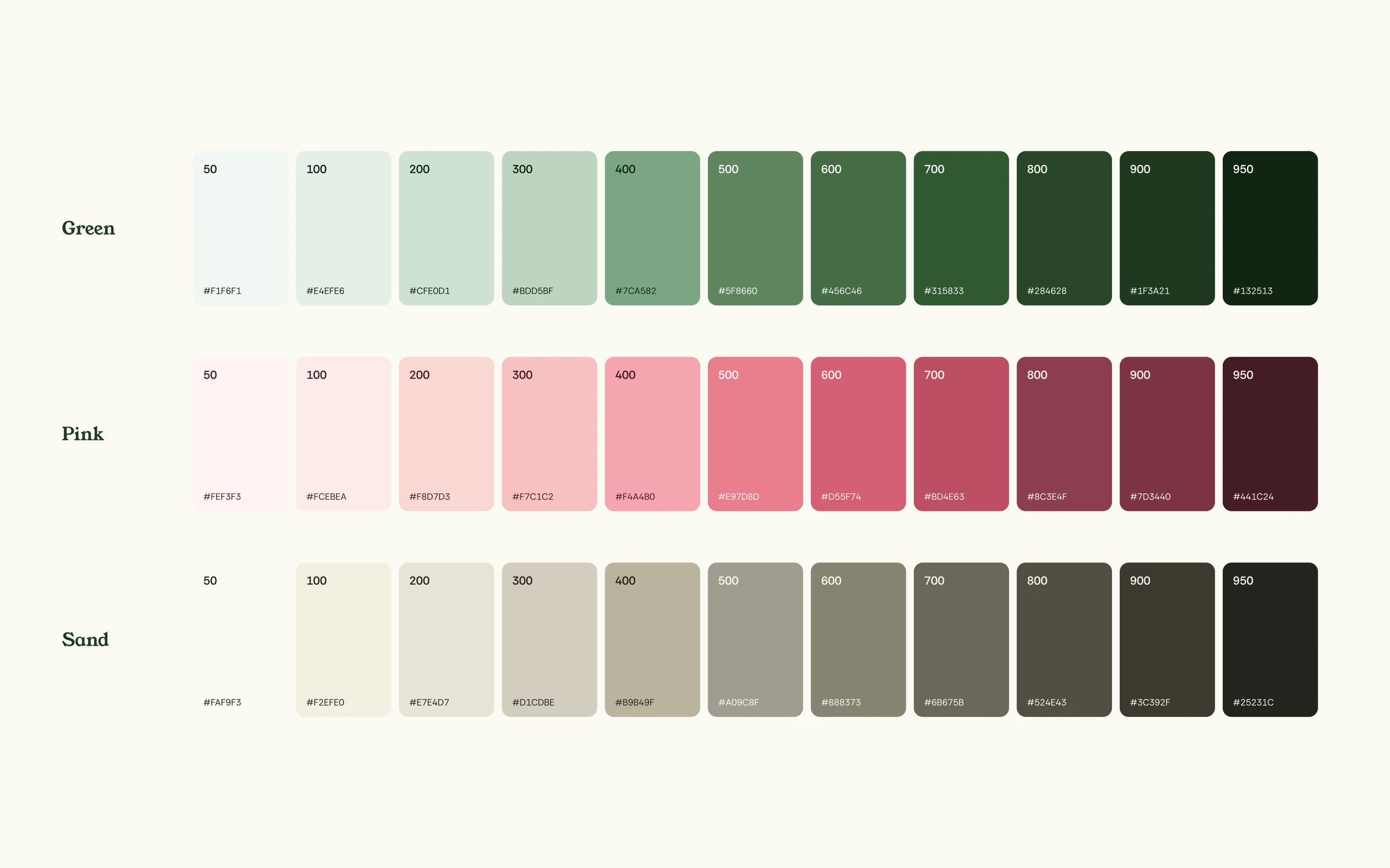
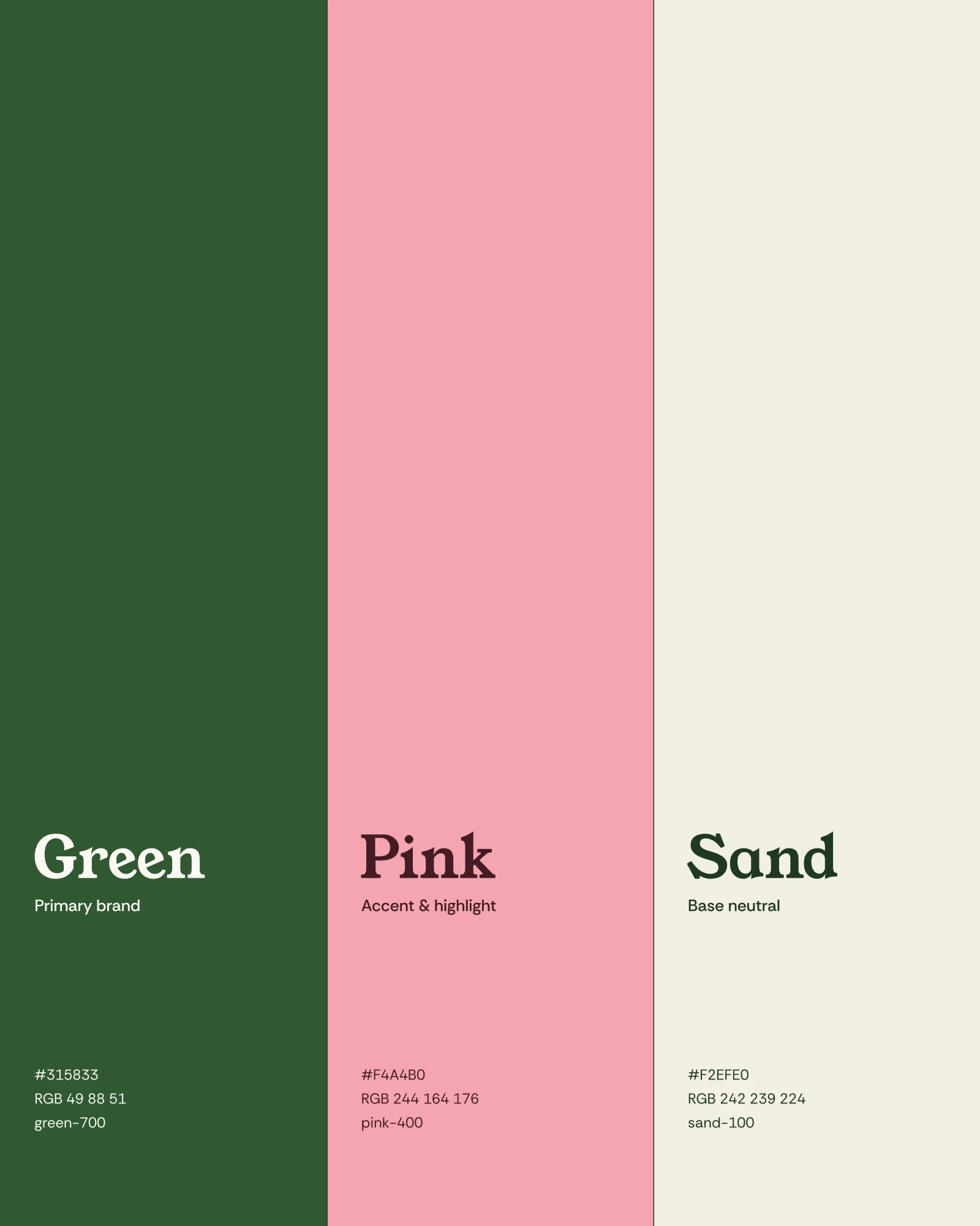
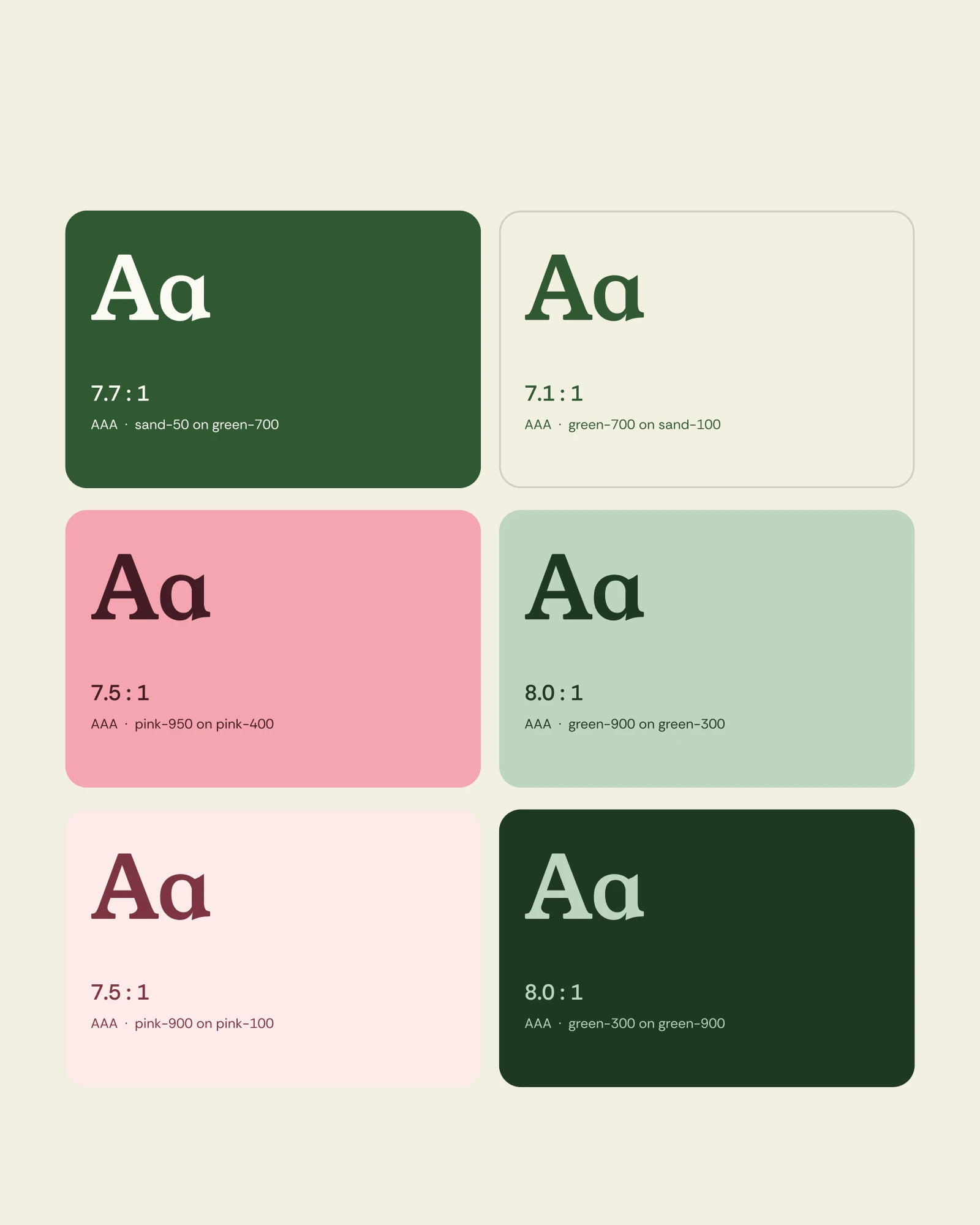
The core trio, and every pairing documented for contrast so nobody has to guess which combinations are safe.
IN USE
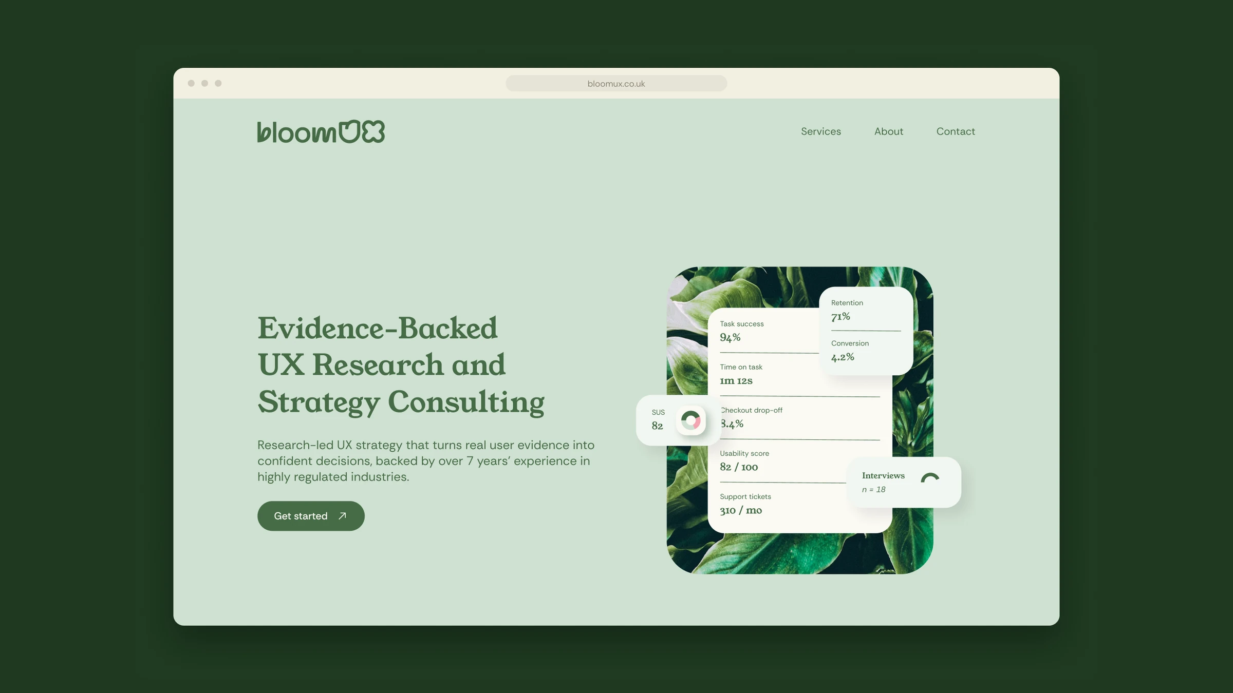
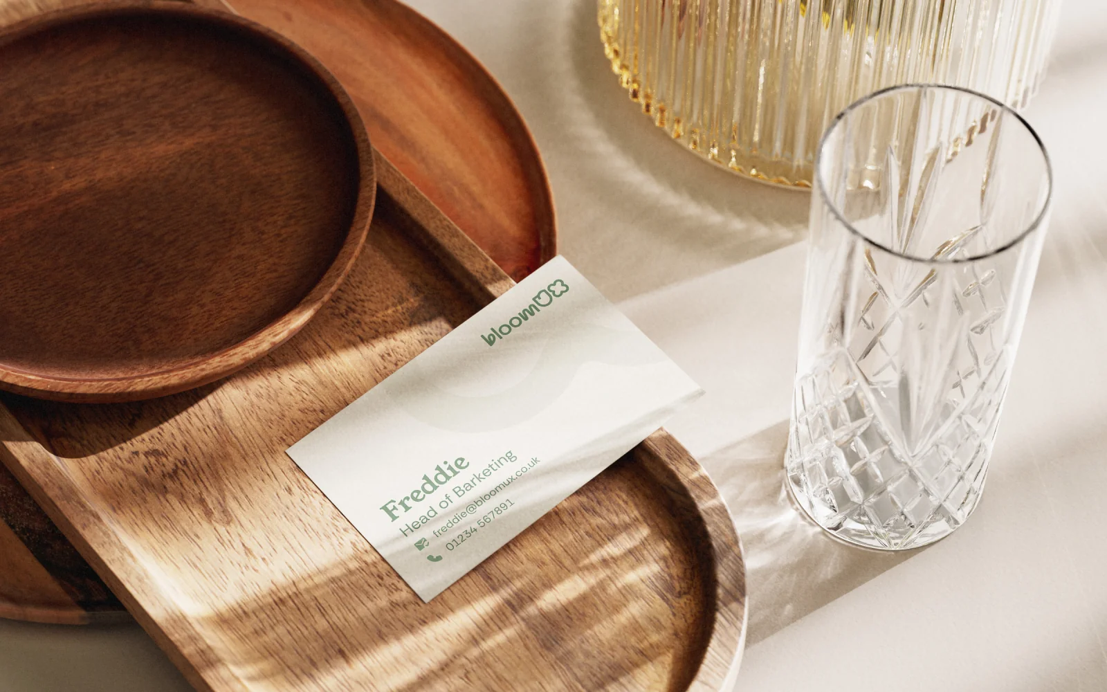
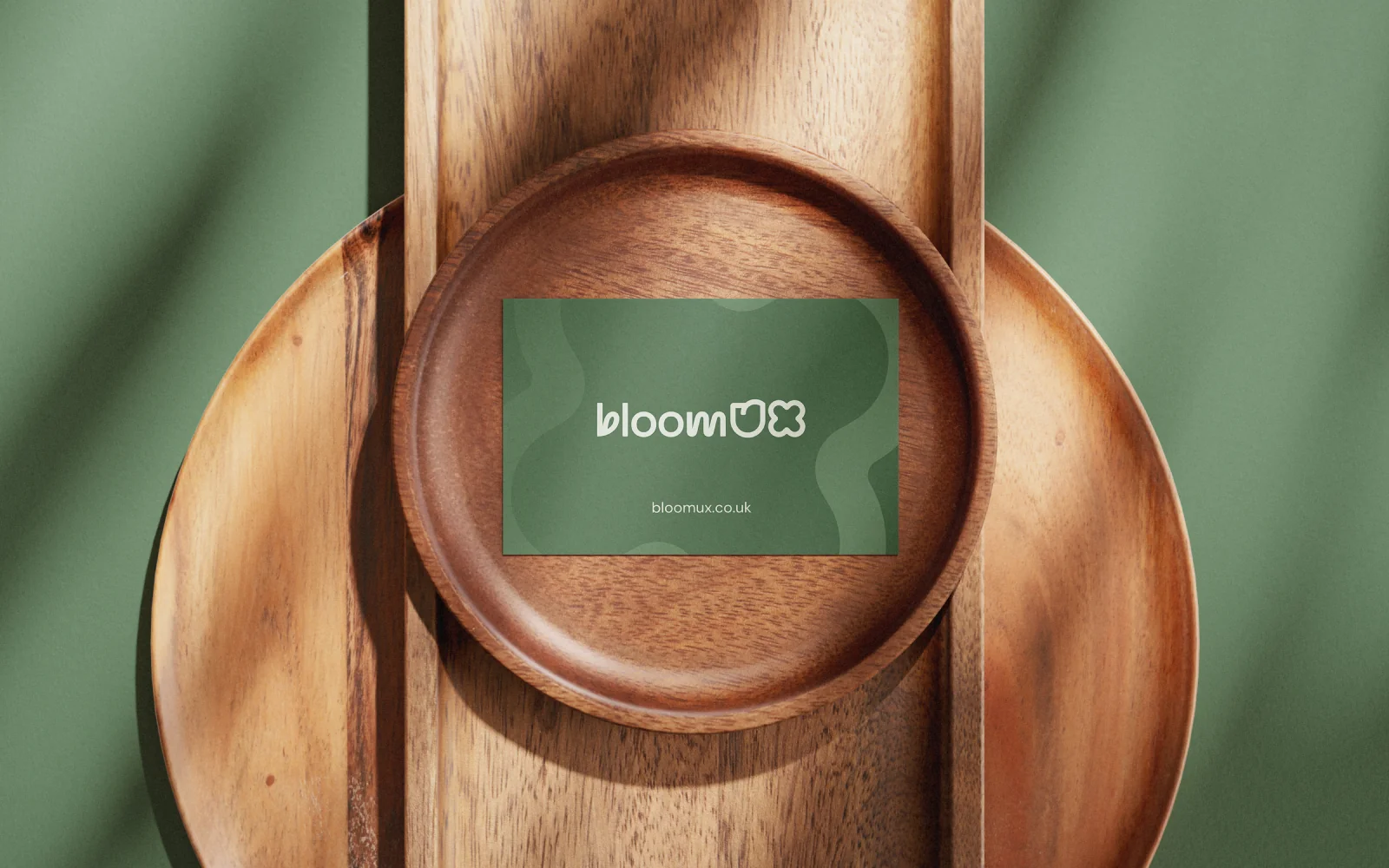
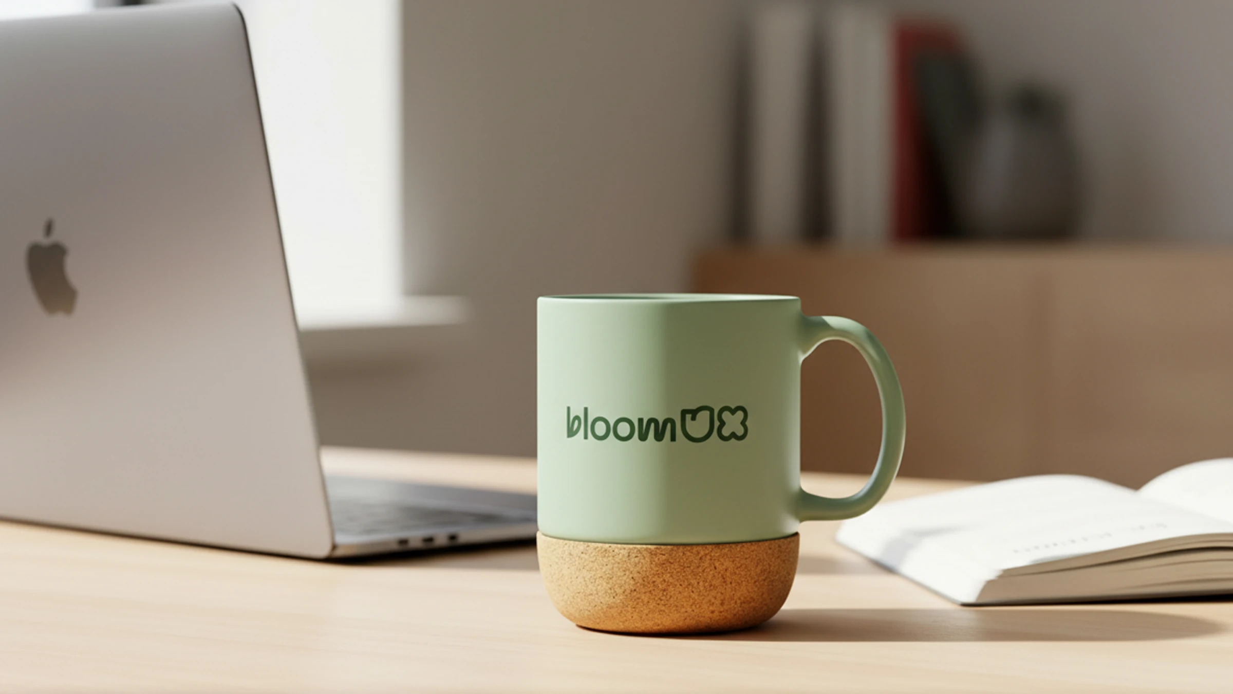
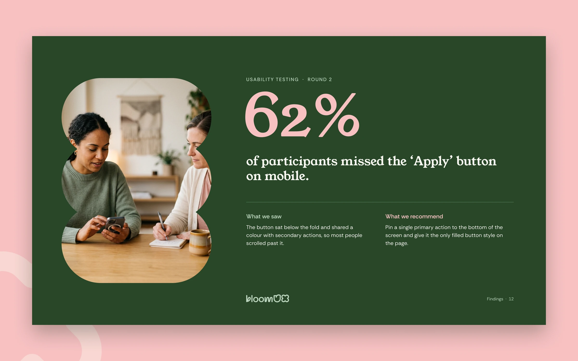
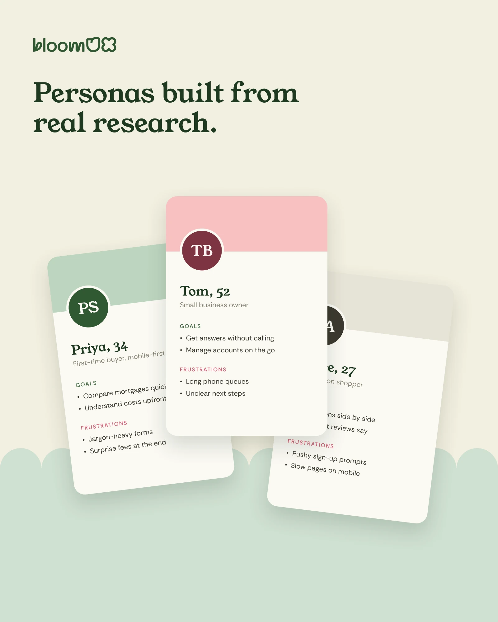
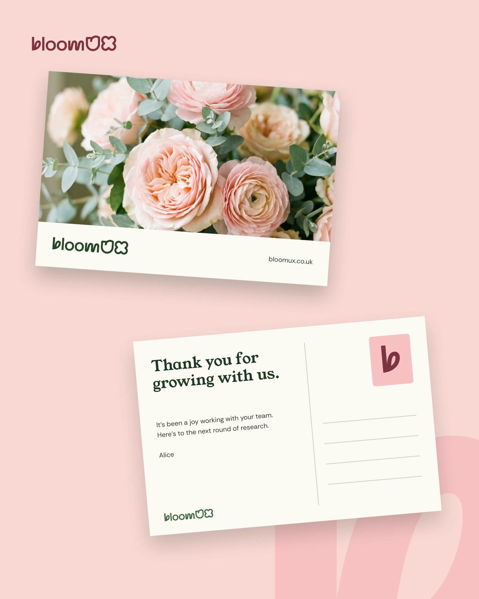
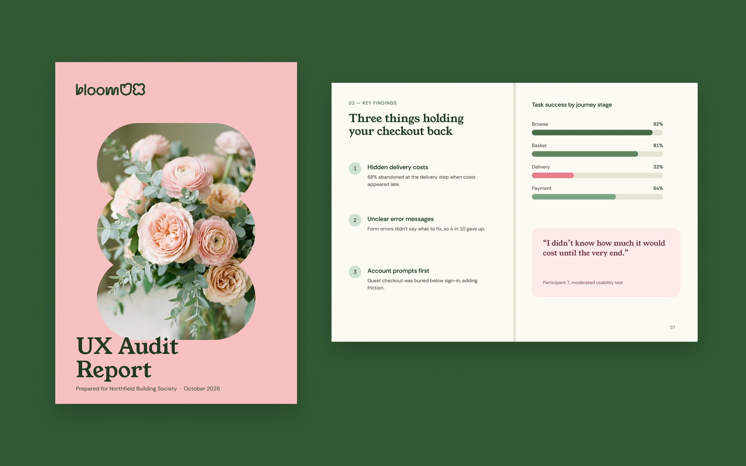
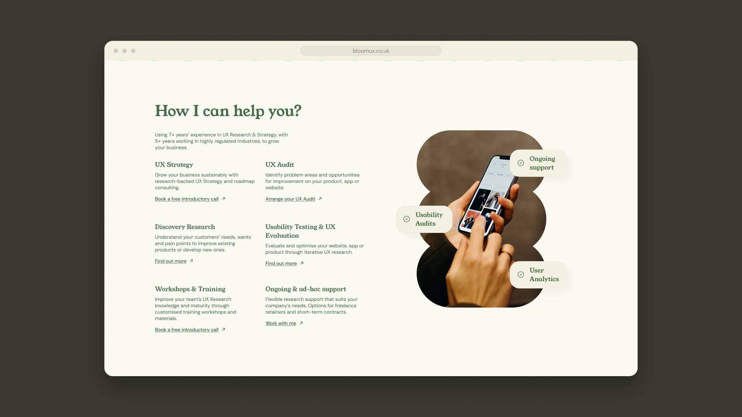
Business cards, the UX audit report, persona cards for workshops, and the site across desktop and mobile.
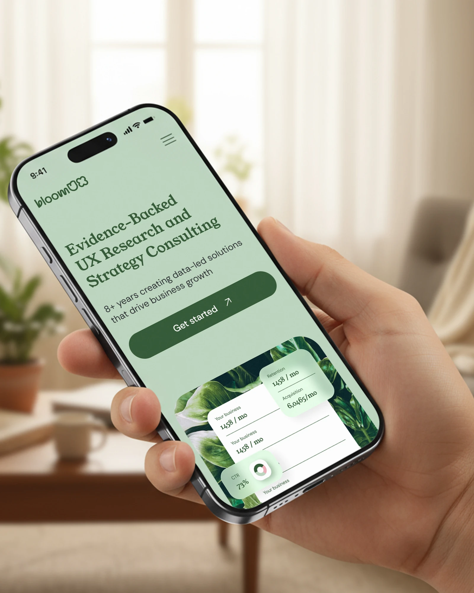
SOCIAL AND COMMS
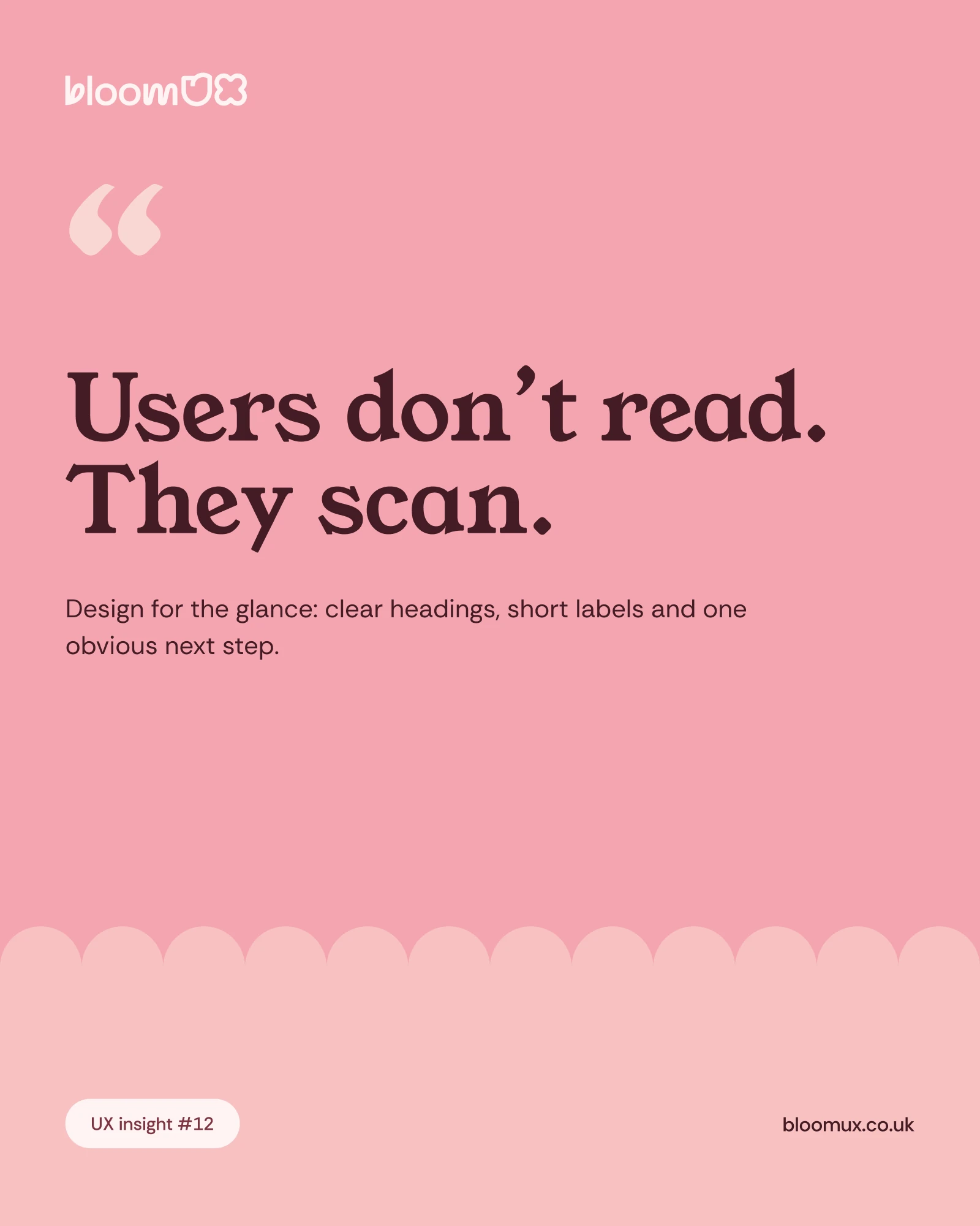
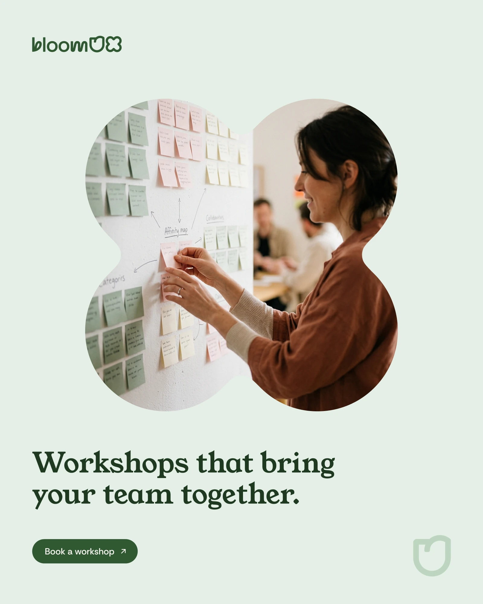
The LinkedIn set, the Bloom Report email and the social templates the team publish from.
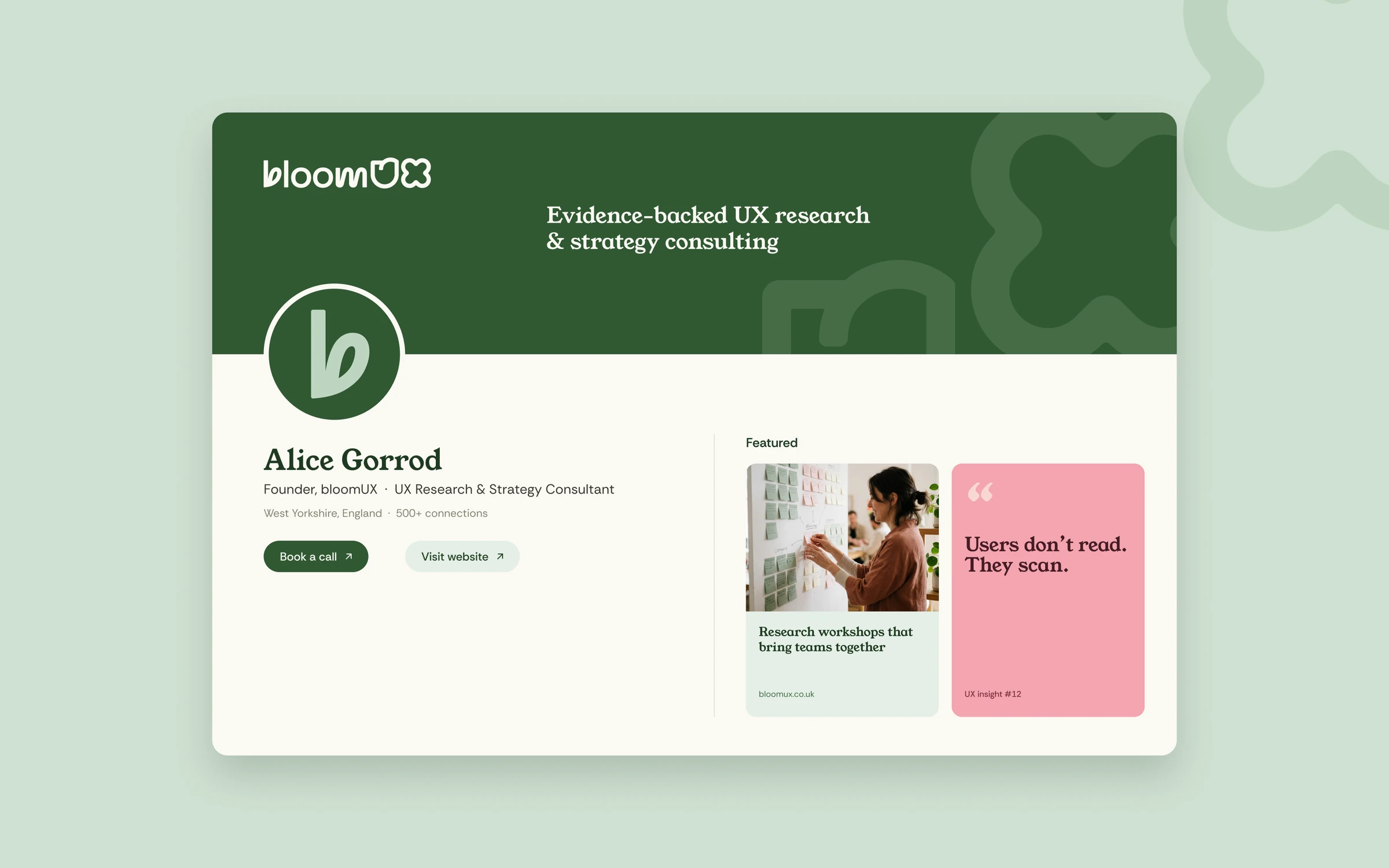
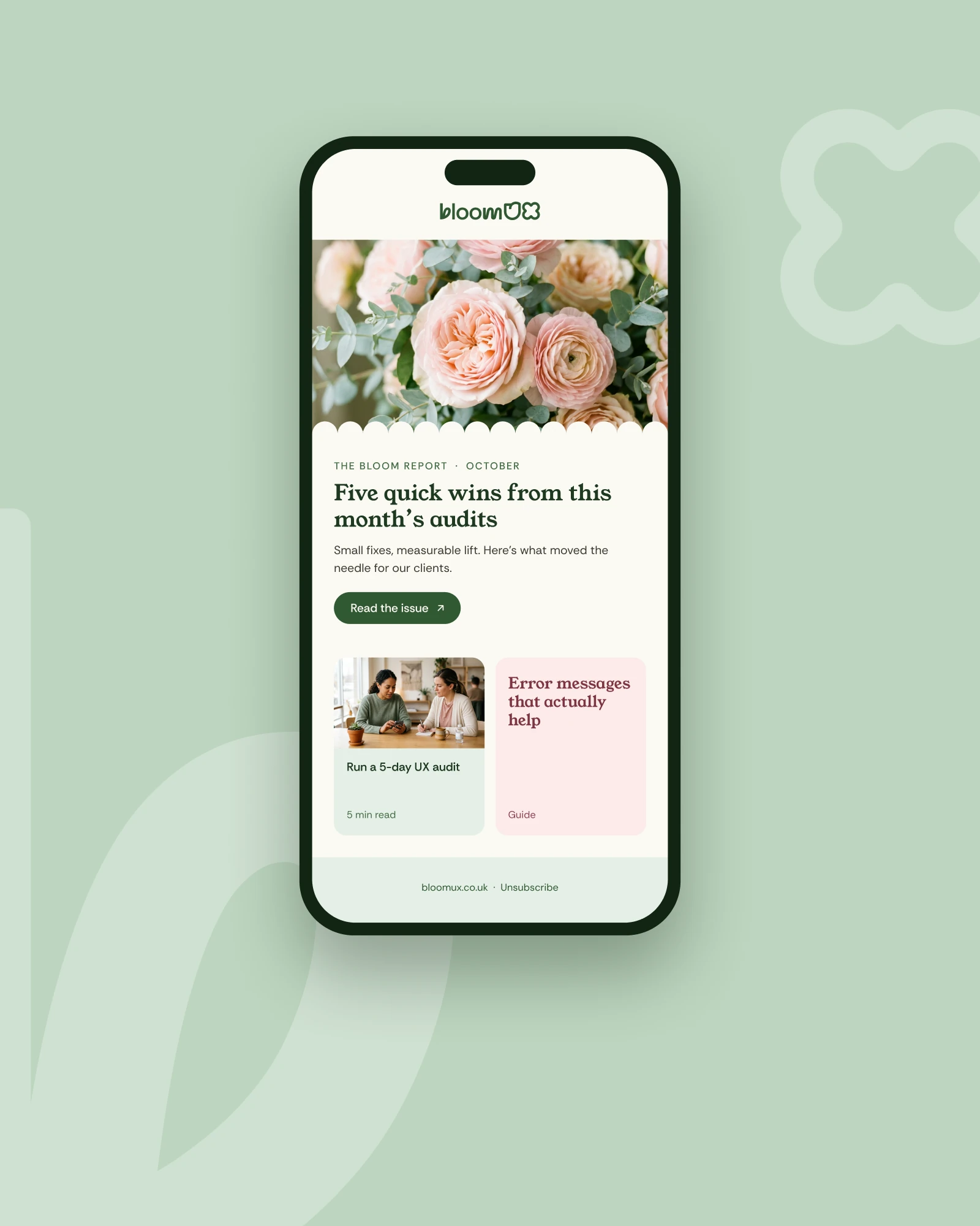
Logo and icon set
Communicating growth, insight and expertise at a glance.
Brand guidelines
They keep social, presentations and digital assets consistent without supervision.
Social templates
So the team publish regularly and stay recognisable while they do it.
Designing for a UX research consultancy means your own rationale gets held to their standard. Every decision, from typeface to palette to icon, needed a reason beyond taste. What came out is a system that feels tight and confident, and one they can grow into rather than out of.
Open to senior and lead design roles.
Get in touch