Grants of Devon
Role
Year
Website
Discipline
Team
Role
Year
Website
Discipline
Team
OVERVIEW
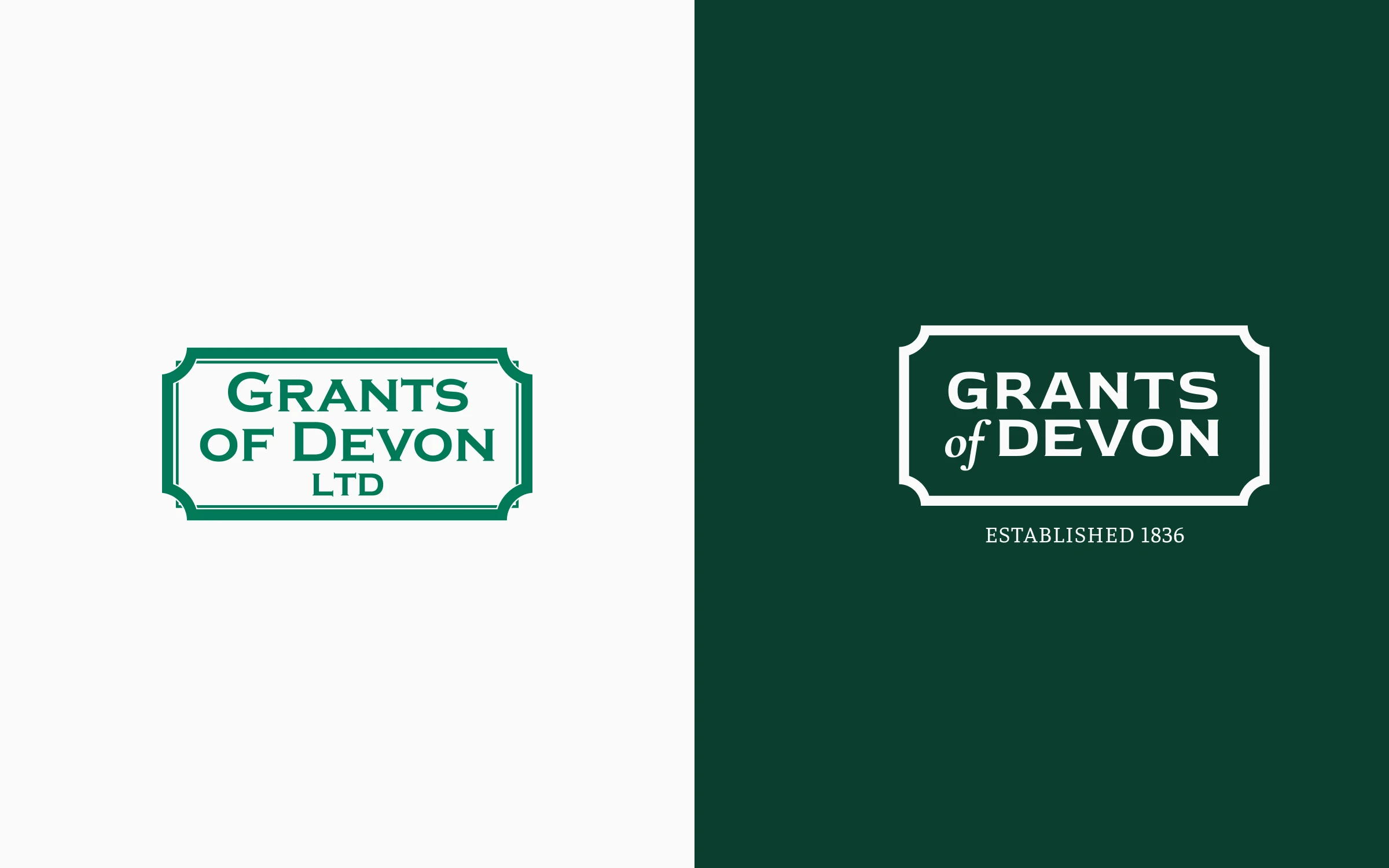
Grants of Devon are stonemasons and marble restoration experts based in Devon. Their existing site was dated in design and structure, could not be updated without technical help, did not work properly on mobile, and never made clear what the business actually offered. They needed a full redesign with better functionality, and were open to a modernised logo alongside it.
I started with the logo, rebalancing its proportions and simplifying the form so it stayed legible at small sizes, on screen, and on signage and uniforms, without losing the heritage it had earned. A neutral, timeless palette went with it, chosen to sit behind the work rather than compete with it. Then I redesigned the site across 10 pages, each structured to lead from services through examples of work to getting in touch, with layouts built around large imagery because stonemasonry sells on what it looks like.
I built the site on WordPress with custom templates, so the Grants team control their own text and images, and added a gallery system that lets them publish new work without a developer. The redesign cut the number of clicks to the content people actually came for, and gave a business founded in 1836 a site that finally matches the quality of the work.
Pages redesigned
Modernised brand mark
Editorial control handed to their team
THE JOURNEY
Grants of Devon, founded in 1836, came to me with a reputation built on word of mouth and repeat clients, but a website that undersold the craft behind the work. We started with the logo: keeping the heritage mark recognisable while making it work cleanly at small sizes and on screen. From there, the site itself grew into 10 pages, each built to let the stonework photography do the talking, with a simpler path from 'browsing' to 'get in touch' than the old site ever had.
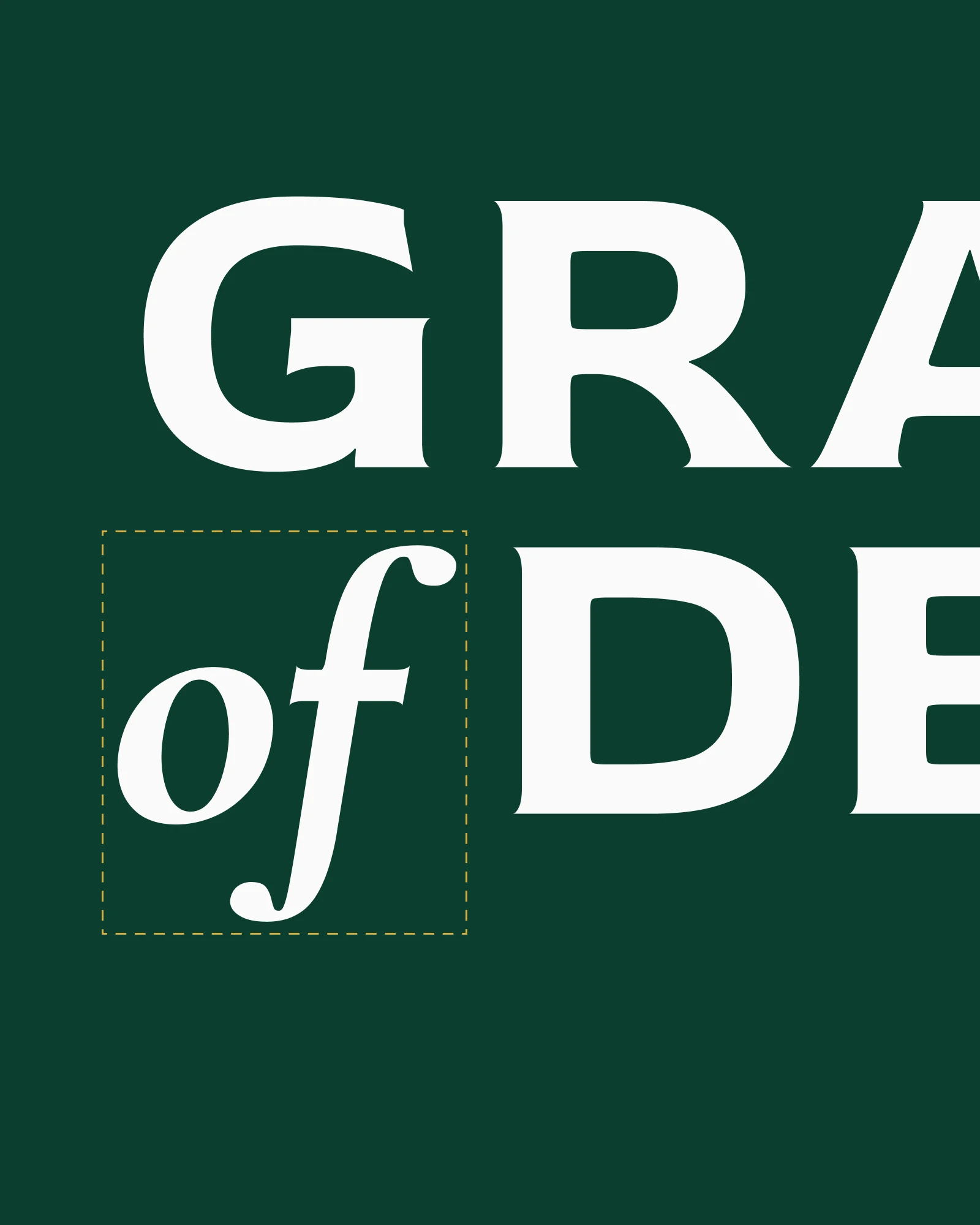
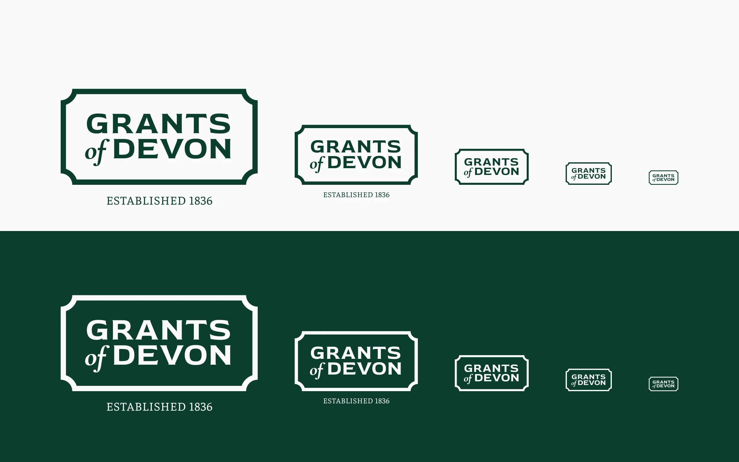
IDENTITY
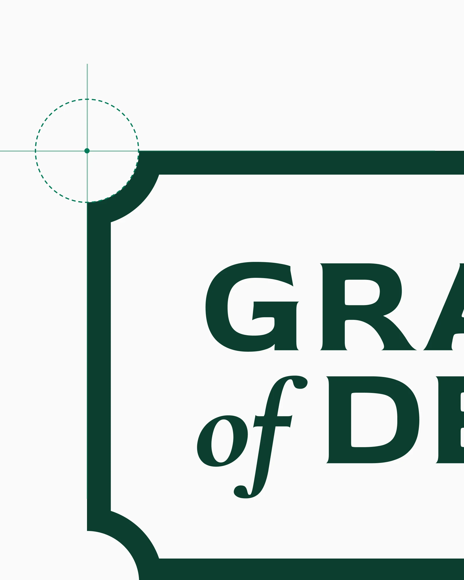
The notched sign-board frame carried over from the original mark. The close-ups show where it was tightened: the corner notches, the wordmark and the indent that seats the 'of'.




DIGITAL
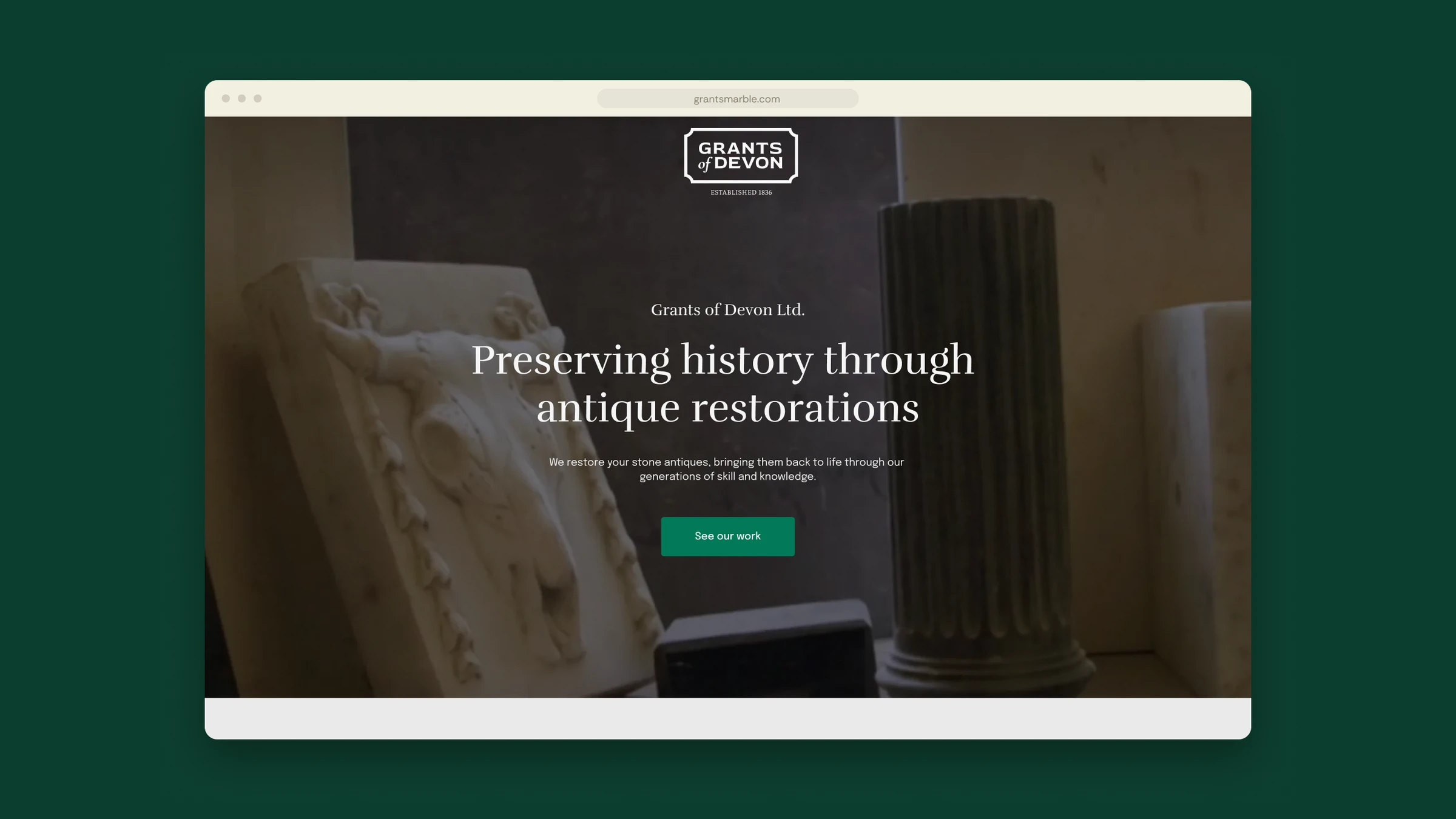
The homepage on a laptop, and the G as an app icon on a phone.


COLOUR AND TYPE
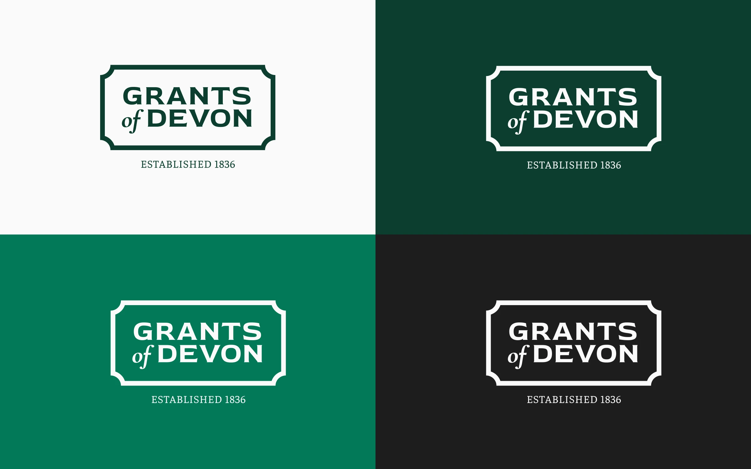
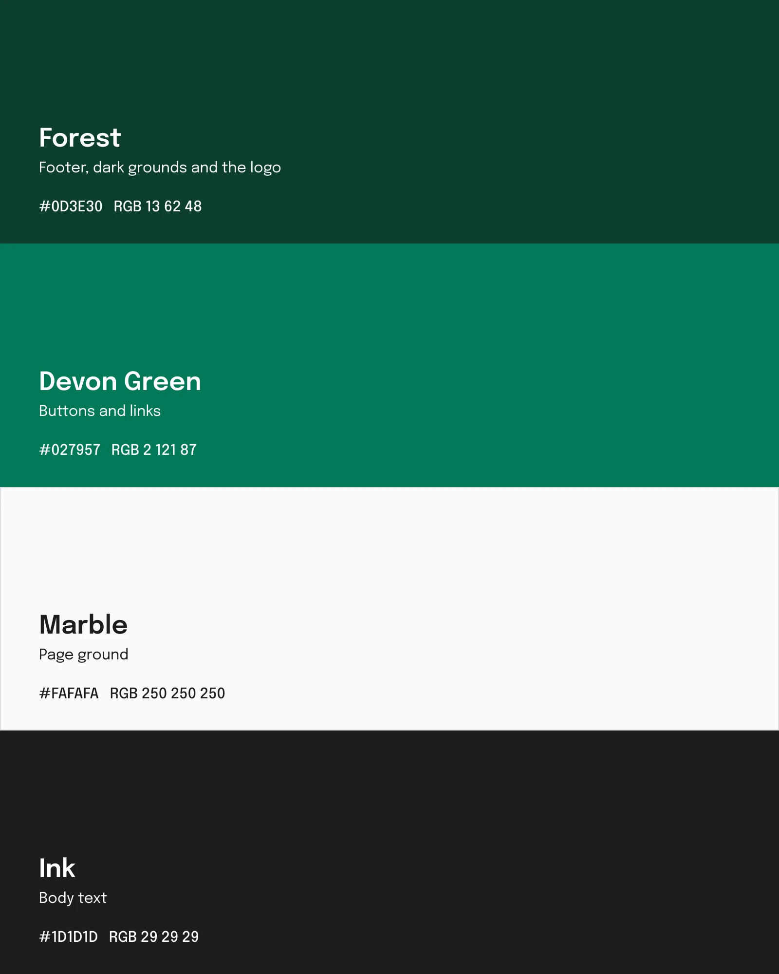
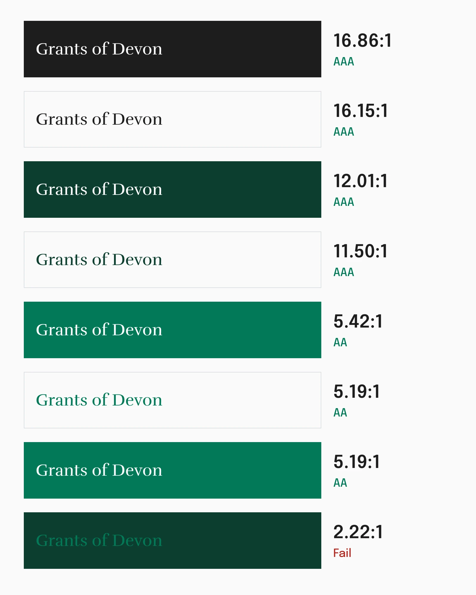
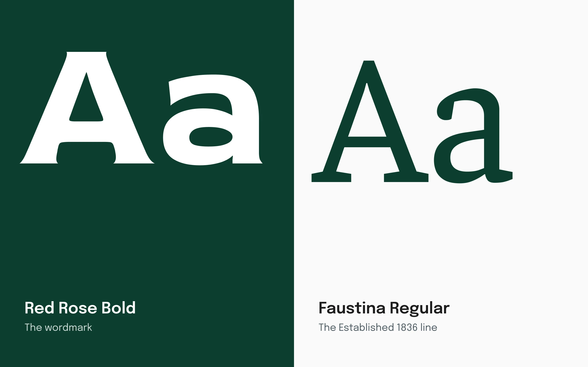
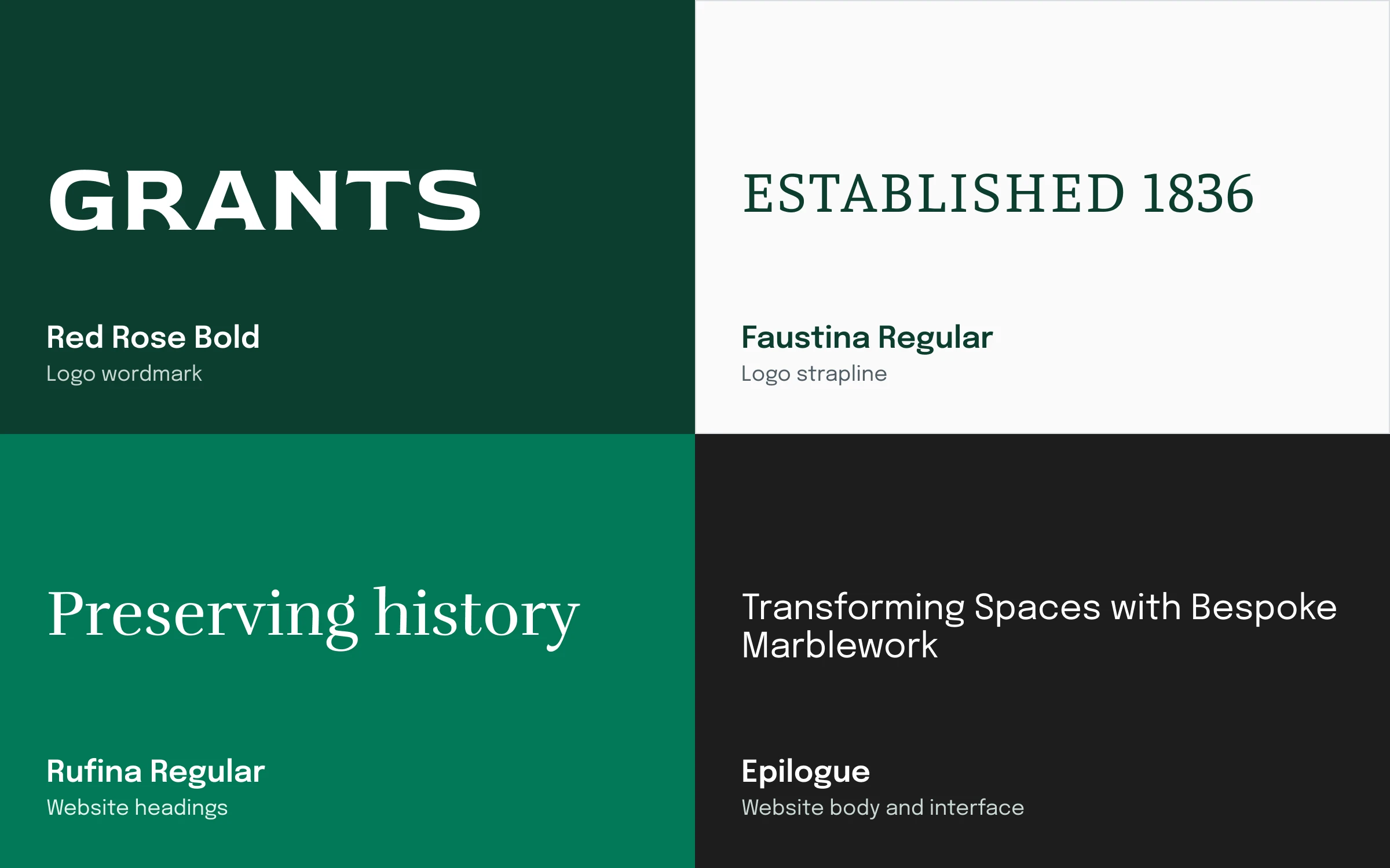
A deep forest green and a brighter green on marble white, with Rufina for headings and Epilogue for body text. The pairings are checked against WCAG.
A site the team runs themselves
Built on WordPress with custom templates and a gallery system, so the Grants team publish new work without a developer.
One logo across every surface
Carried onto signage, vehicles and stationery without a single compromise on legibility.
The first redesign in the company's history
A business founded in 1836, brought onto one identity for the first time.
The hardest part wasn't the redesign itself. It was giving a craft brand that has traded since 1836 room to feel current without losing the credibility that comes from that heritage. Handing the team a site they can genuinely maintain themselves, without needing a developer for every content change, mattered as much to me as how it looks on day one.
Open to senior and lead design roles.
Get in touch