Plasma by Medichecks
Role
Year
Website
Discipline
Team
Role
Year
Website
Discipline
Team
OVERVIEW
Plasma is Medichecks' Diagnostics-as-a-Service platform, selling blood testing to businesses rather than consumers. It needed an identity that belonged to the Medichecks family but could hold its own in front of a different buyer: HR leads, clinical partners and procurement, not individuals. Once that existed, it had to be proved on every surface the sales team needed, one project at a time.
I took the brand out of the guidelines and into the things that had to sell it, project by project. A B2B test catalogue partners could navigate by biomarker rather than scroll. A shell scheme for exhibitions, with the printed documentation to match. Dual-branded sample sleeves so partners could put their own name on Medichecks tests. Campaign and product landing pages built to the same system. And 3D product visualisation for the kit range, so packaging could be shown before it existed. The website itself was a team effort rather than mine alone.
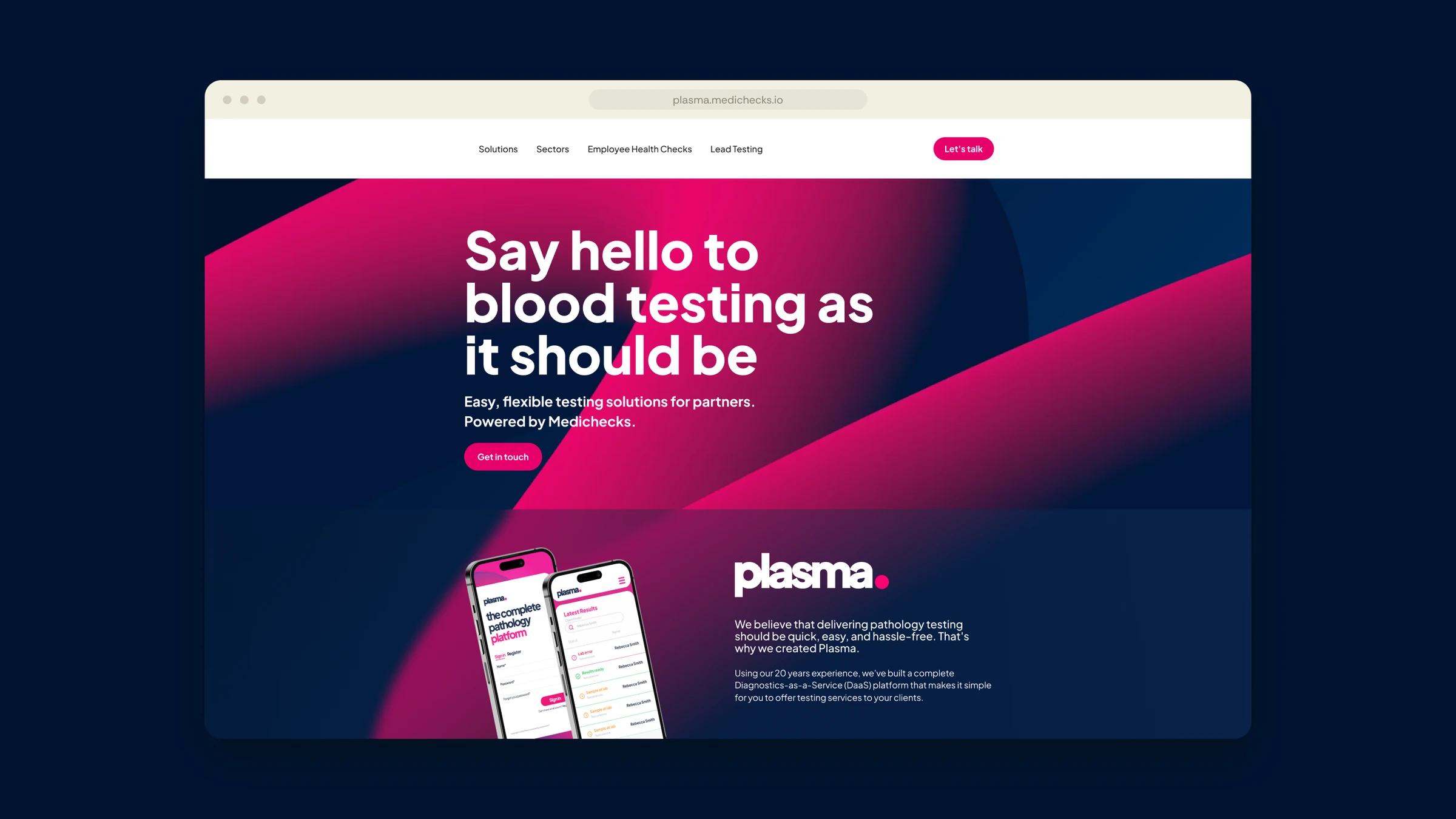
The brand treatment and page system are still in use on plasma.medichecks.io, which now carries a testimonial from NHS Blood and Transplant. It has lasted because it was built as a system rather than a set of one-off assets.
Brand treatment and page system in use on plasma.medichecks.io today
Hundreds of tests, searchable by biomarker rather than scrolled
One system across exhibition, packaging, web and print
THE JOURNEY
A new B2B brand does not prove itself in the guidelines. It proves itself the first time someone blows it up to a stand panel, shrinks it to the end of a sleeve, or asks whether a partner's logo can sit beside it without either brand losing. That was the work: taking the identity into one surface after another and finding out where it worked and where it did not. The catalogue mattered because partners needed to find one test among hundreds by biomarker, not scroll a price list. The 3D visualisation mattered because we could show kits and partner co-branding before anything was printed. The test of whether it worked is not how it looked at launch. It is that the site still runs it.

IDENTITY
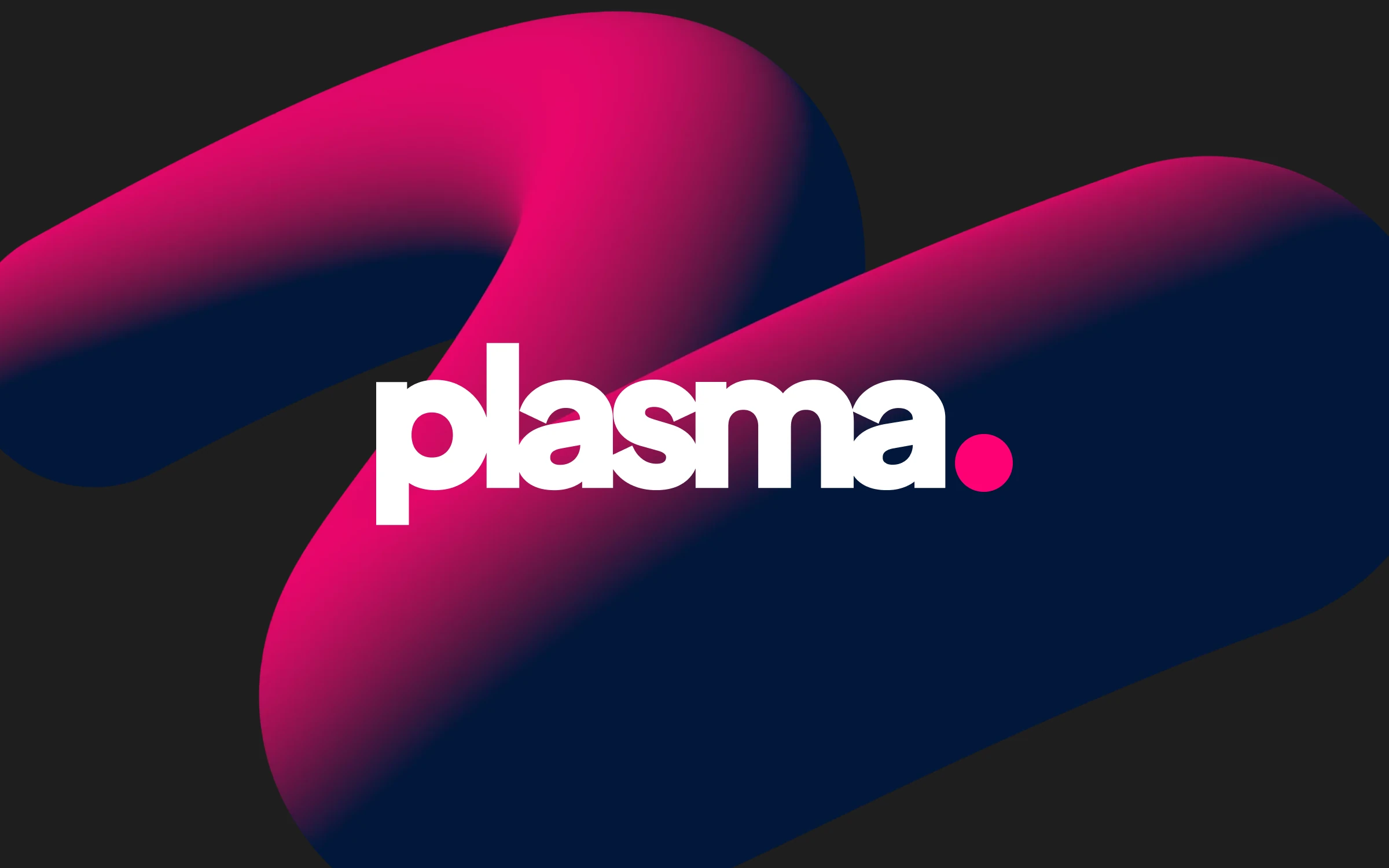
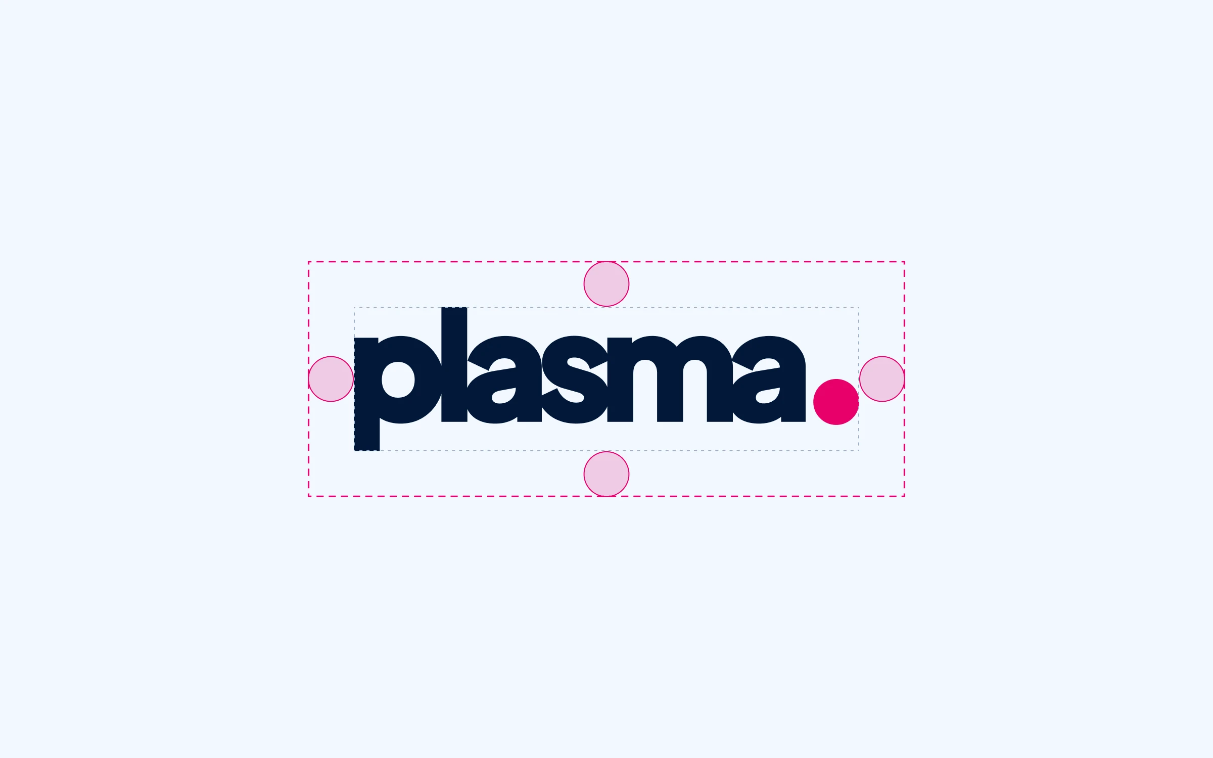
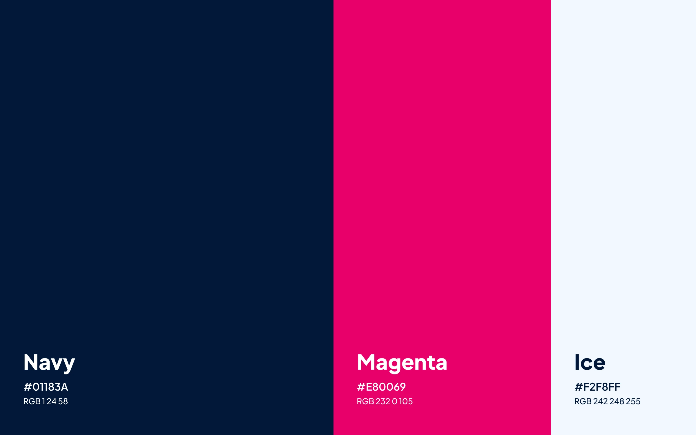
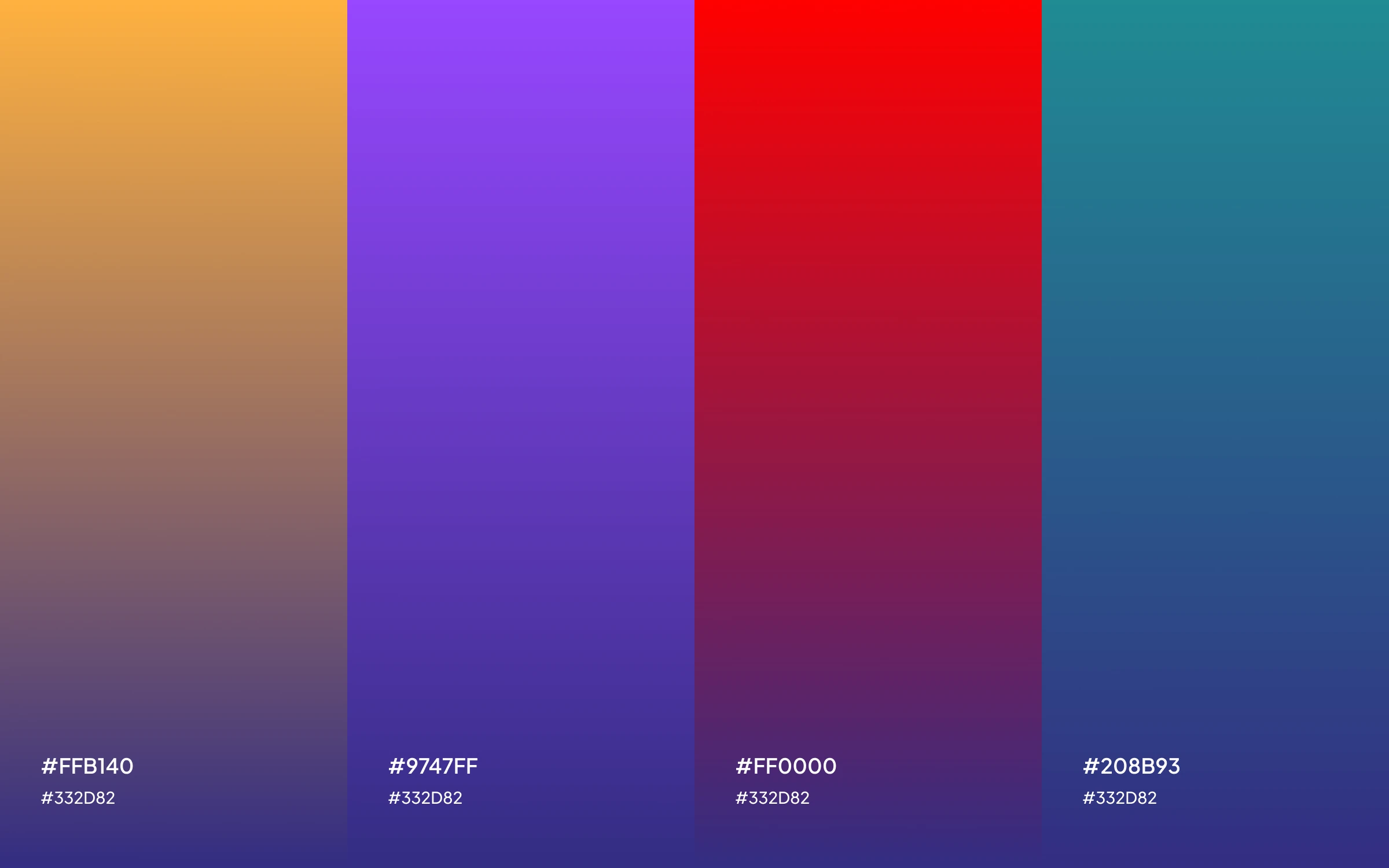
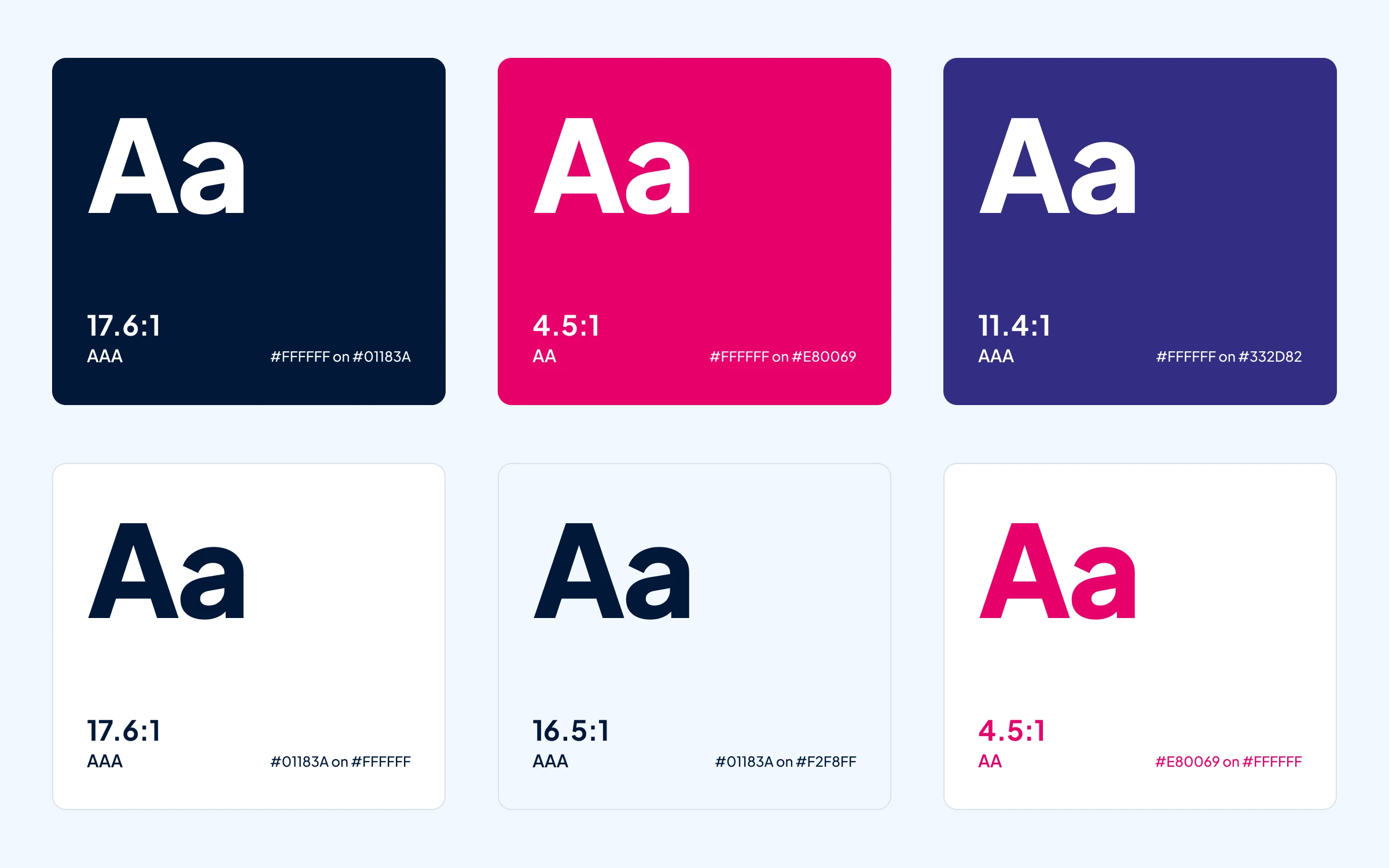
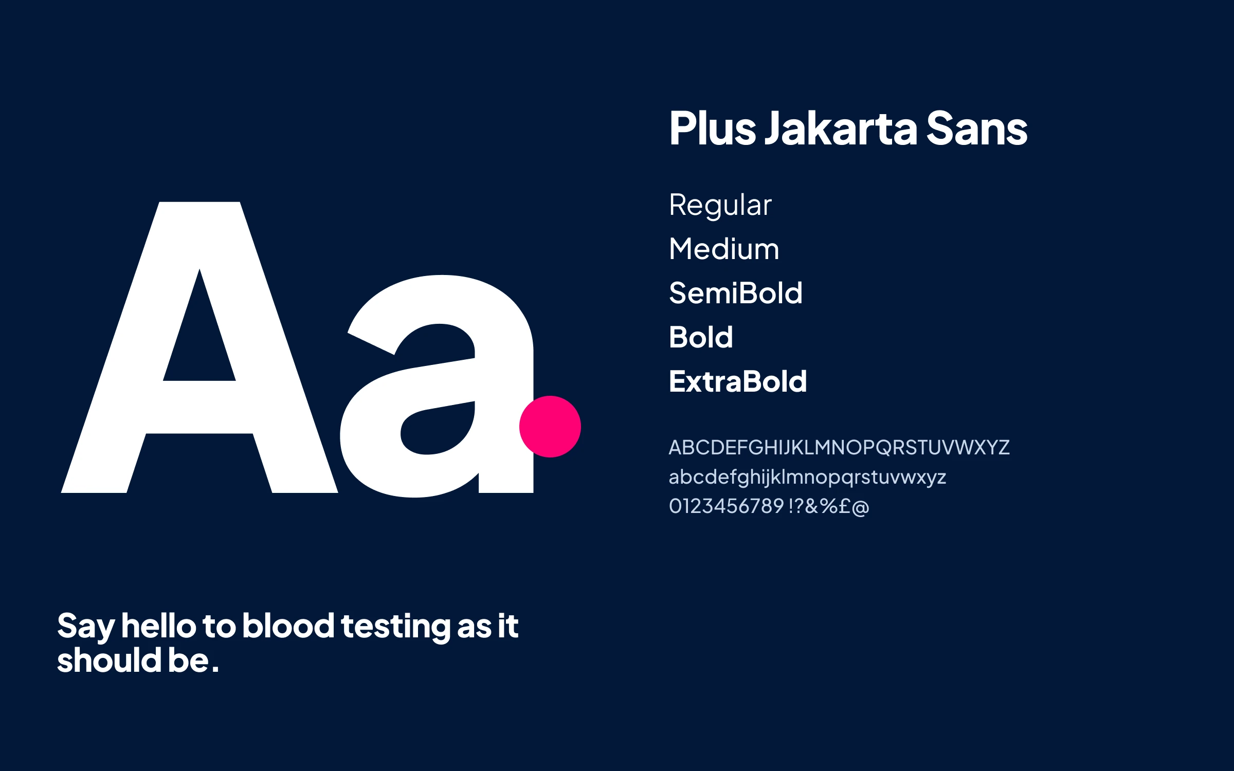
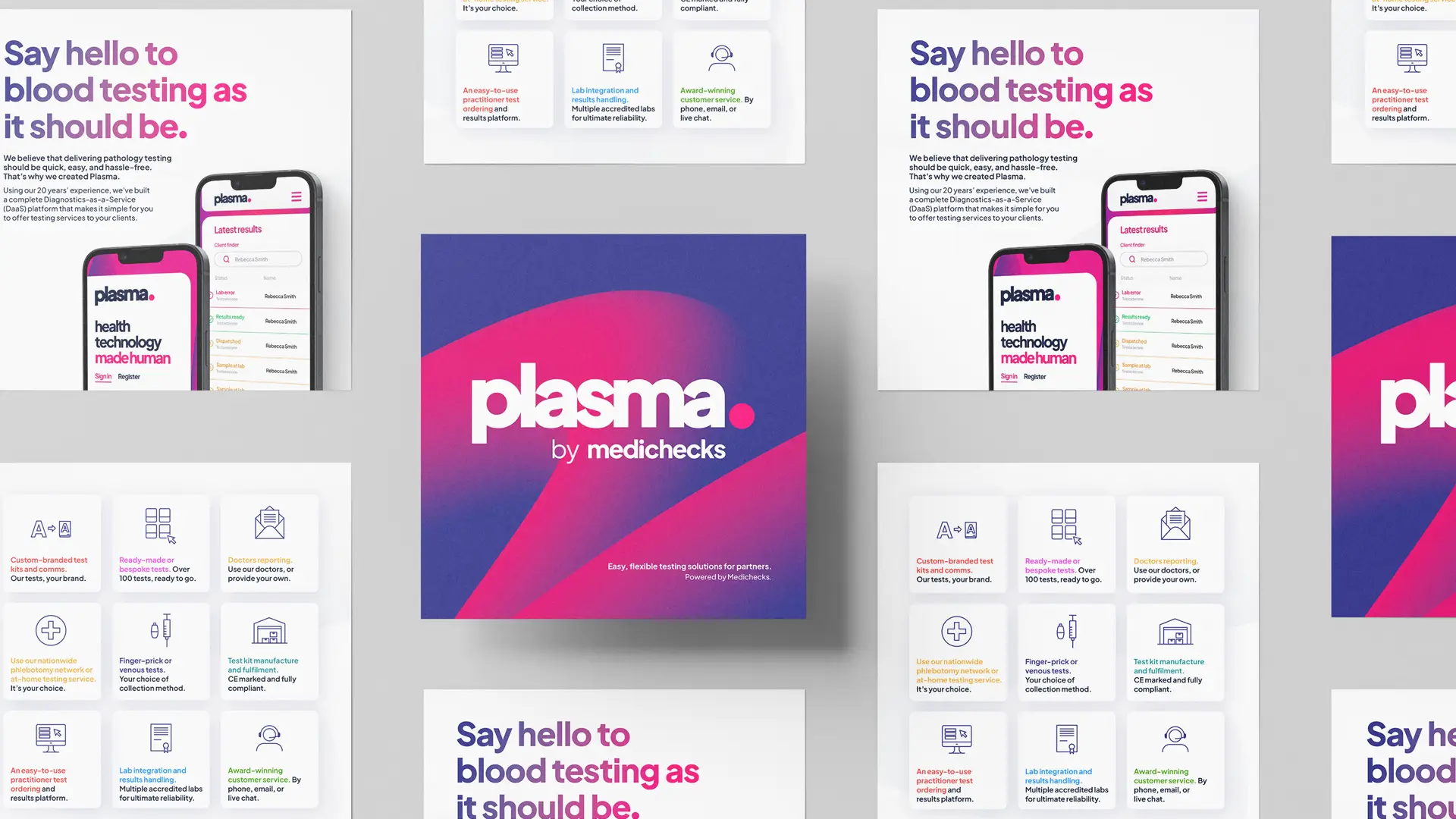
The system the rest of the work was built on: the wordmark and its dot, a navy and magenta core, and Plus Jakarta Sans throughout.

PRINT AND CAMPAIGN
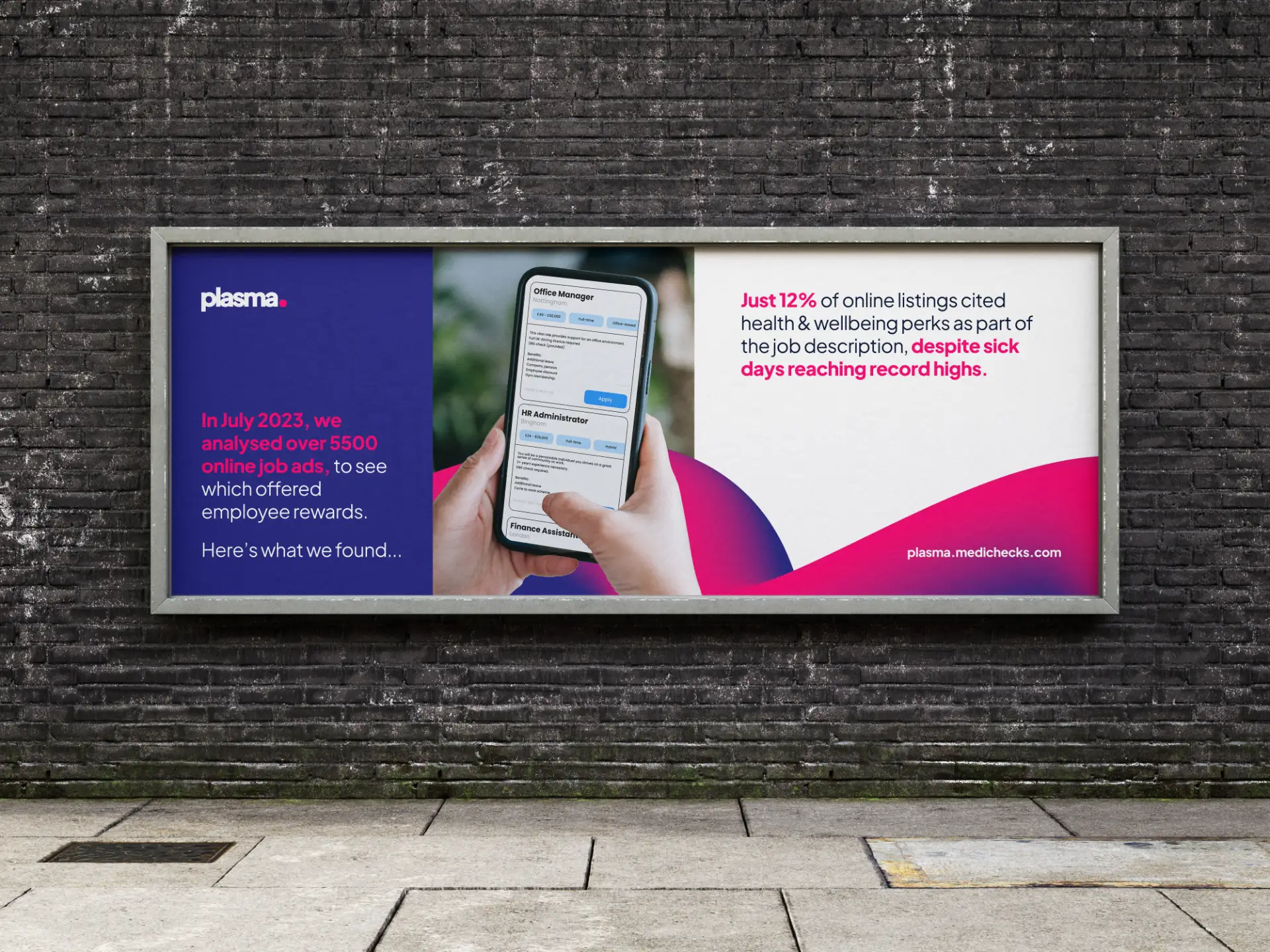
The partner brochure, and a campaign built on our own research into how rarely job adverts offer health benefits.
PACKAGING
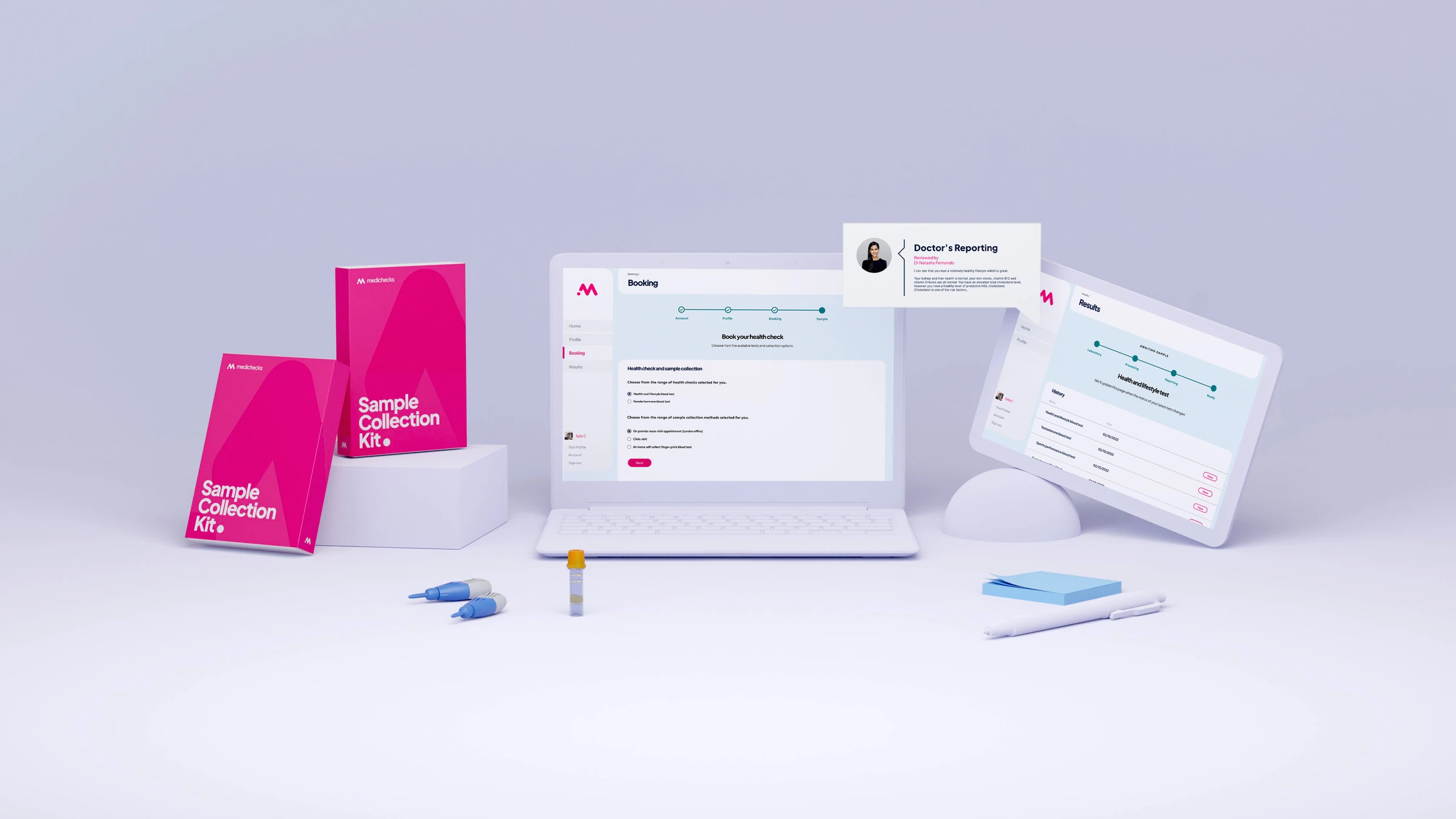
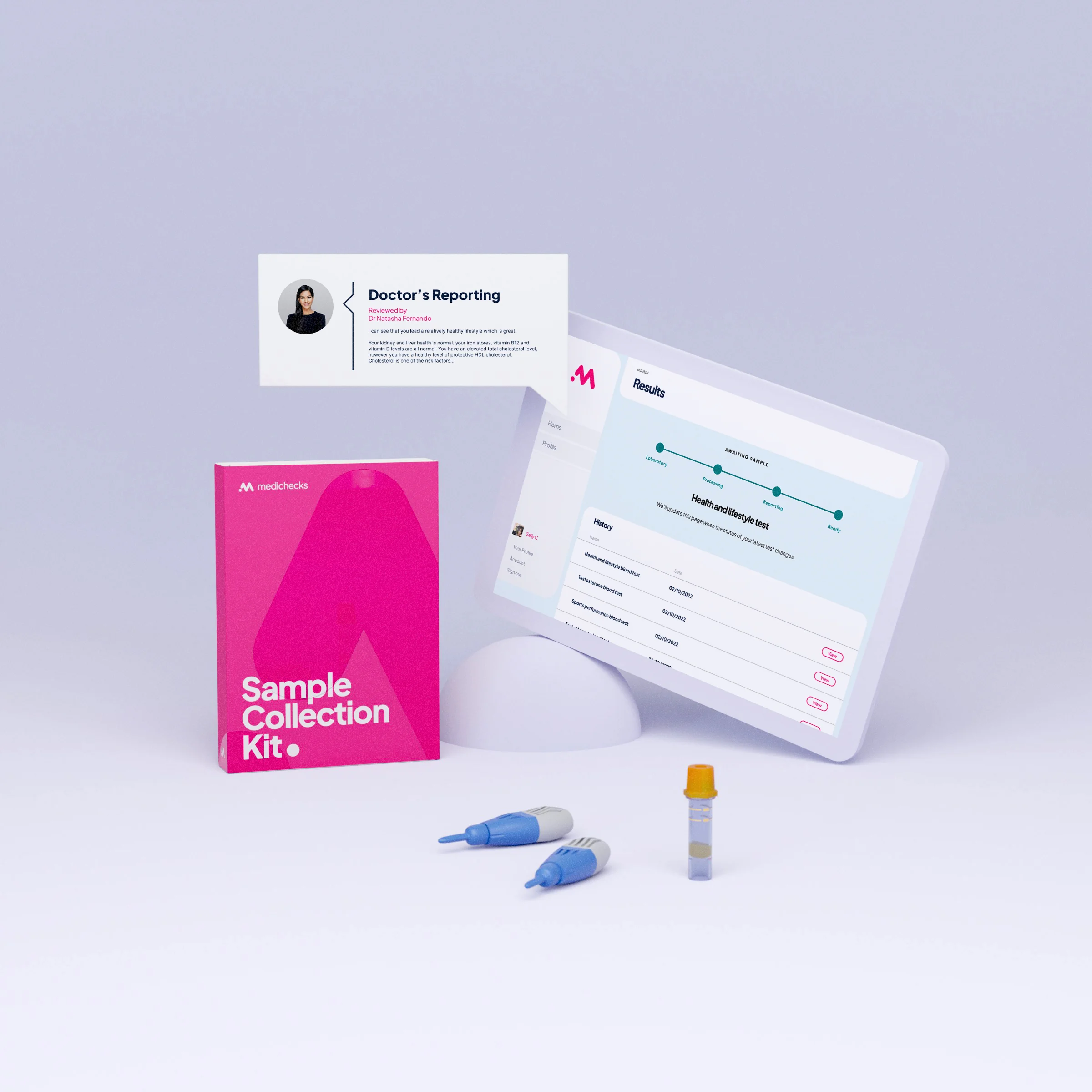
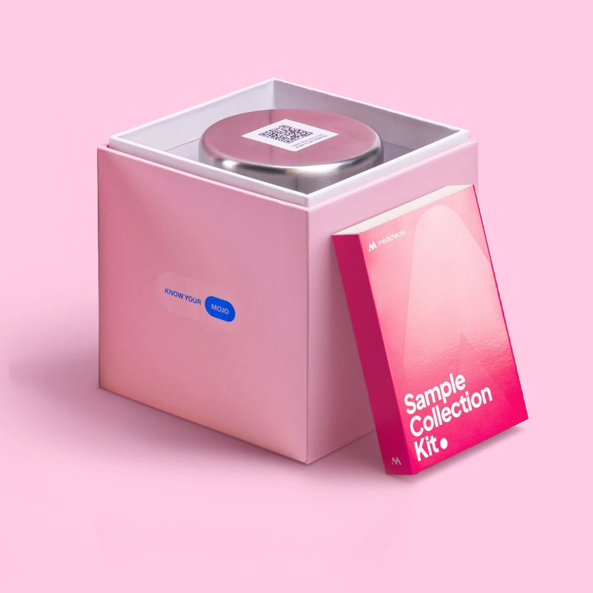
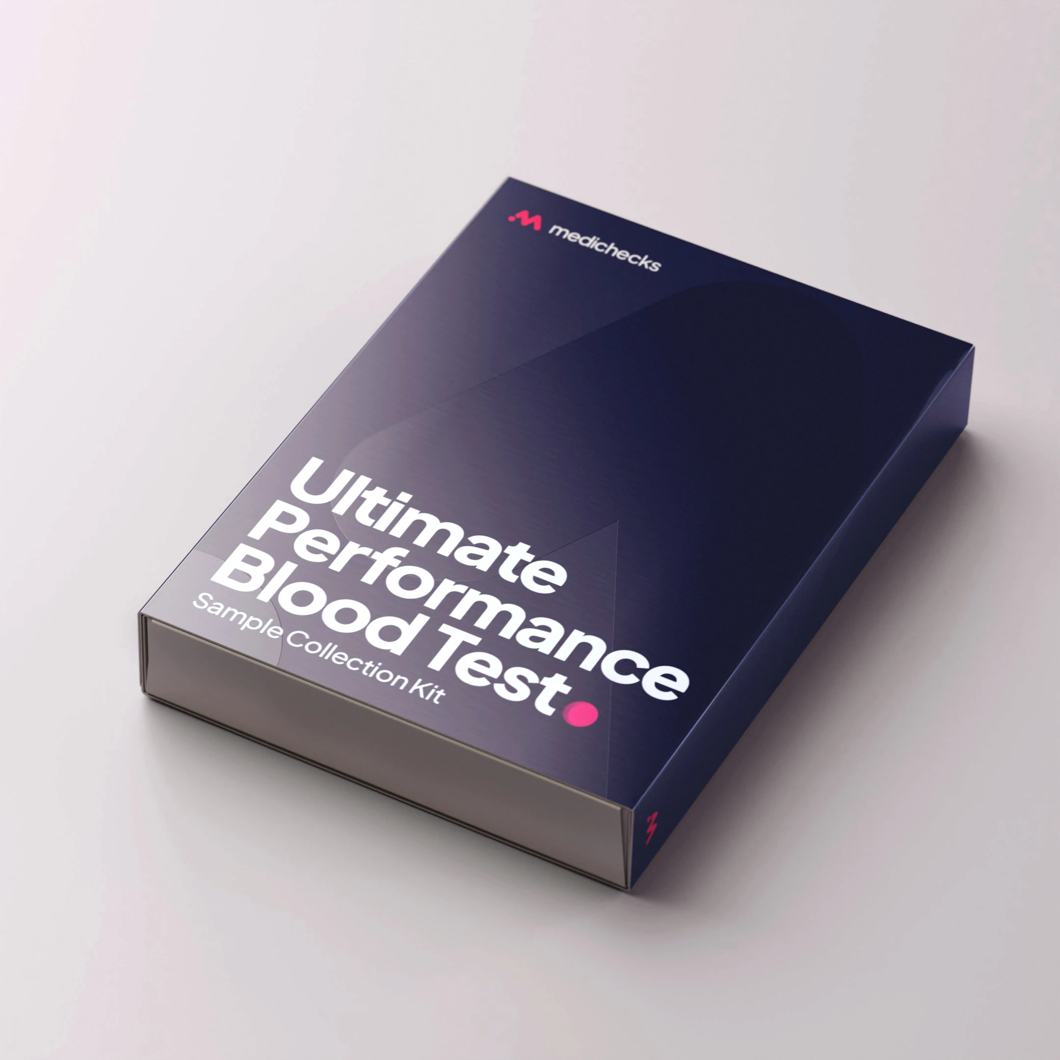
Dual-branded kits and 3D visualisation, so partners could see their own name on a Medichecks test before anything went to print.
DIGITAL
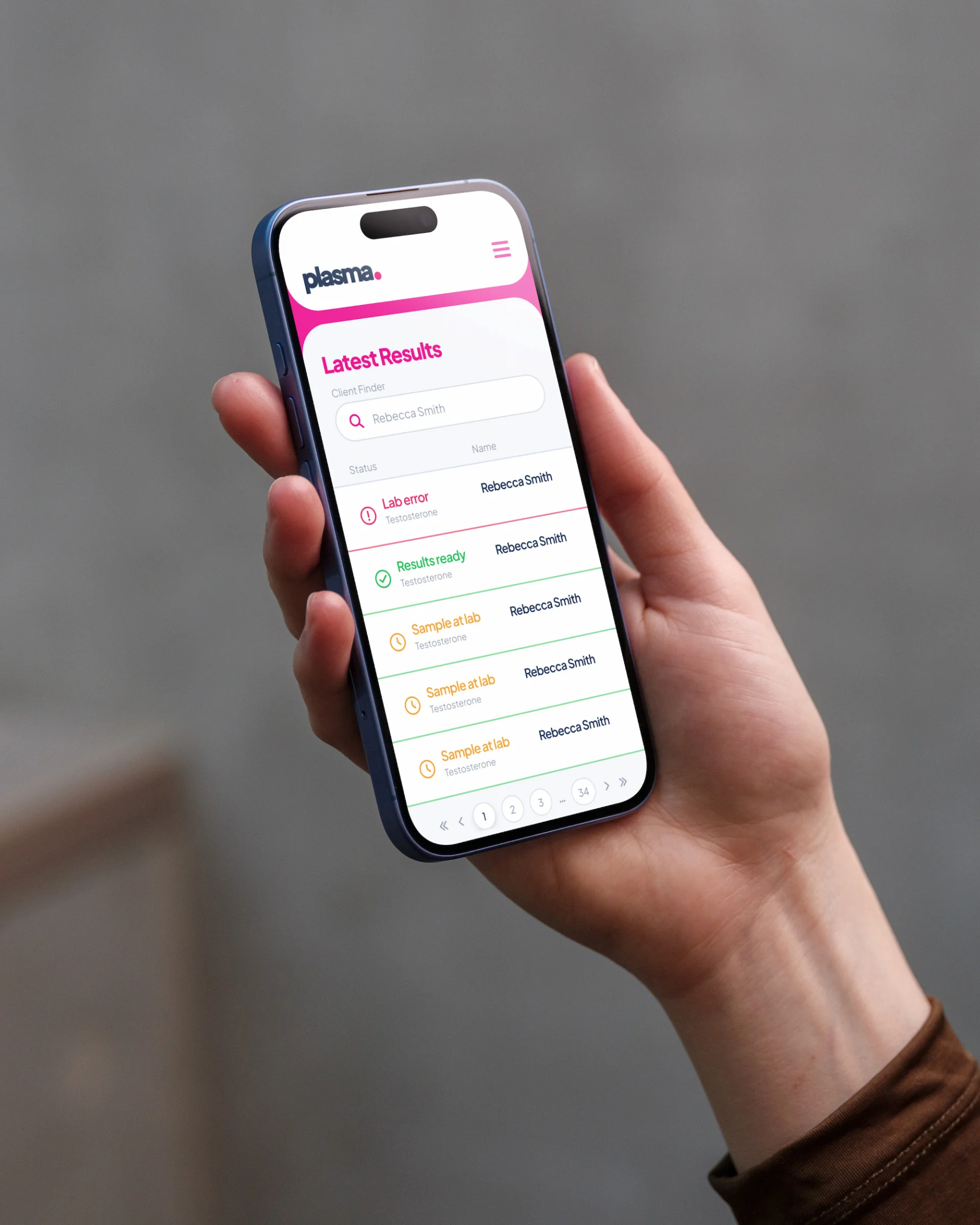
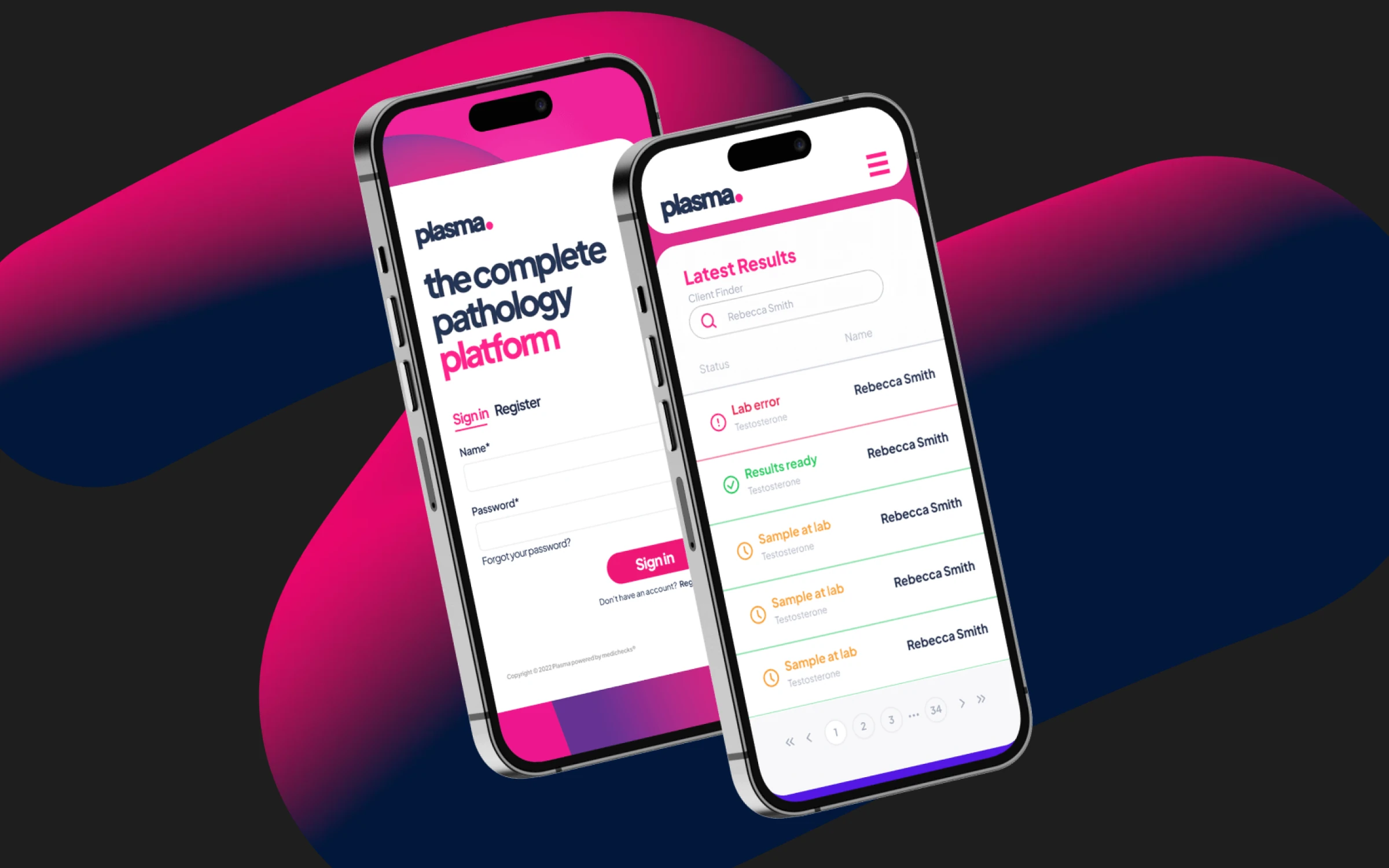
The partner site and its results app. The site was a team build; these show the brand carried across it.
B2B test catalogue
Partners search hundreds of tests by biomarker rather than scroll a price list.
Exhibition presence
Shell scheme, stand graphics and the printed documentation that went with it.
3D product visualisation
Produced for the kit range, so packaging and partner co-branding could be sold before production.
B2B taught me a different register. Consumer work can lean on delight. This had to earn institutional trust from buyers who were putting their own name on our tests. The dual-branded sleeves made that literal: good enough to carry someone else's brand, distinct enough to still read as Plasma. What I would tell myself now is that I undersold the system. I treated each project as the deliverable. The deliverable was the kit of parts that let other people keep going without me, and that is the part still standing.
Open to senior and lead design roles.
Get in touch